


articles/Weddings/albumchallenge-page2
by Mike McNamee Published 01/06/2005
• If the theme is not obvious to the viewer it is not a theme! This can depend on the sophistication of the viewer - some things go right over the heads of all viewers, so this is a tricky area.
7. There is a fine dividing line between an album looking exciting and dynamic and an album looking like an amateur's first mess! Tread with care, take advice, show it around, before you deliver it!
8. Use a grid or guide system. Pictures that are nearly but not quite aligned look like mistakes! Varying the gutter and margin distances just looks like sloppy workmanship so don't even think about it! Make sure you include bleed if the composition runs right to the edge of the page. Three millimetres is typical but take advice from your printer.
9. If you use text, keep to the same font and don't use upper case for stuff that is to be read! If you are setting poetry, learn about typographic conventions before you plunge in. Think about the use of ligatures and swashes for really classy type-setting. Make sure you spell check - we see more albums with spelling errors that you would ever imagine in such prestigious articles. 10. Don't forget to add your contact details in a discrete place. Remember you are providing your client with an album, not a brochure for your business.
The Album Page Challenge
Making up album pages from other people's work is always a challenge. We set the task for Dave Simm and Tom Lee himself, both of whom do this sort of thing for a living! Your editor then pitched in with his own session, deliberately using different approaches, software and techniques. The images were plucked from a wedding conducted some time ago and were intended to be a little tricky, no catwalk models, village greens, ancient castles, quaint country churches and Dallas film sets here!
All attempts were timed so that the true cost of generating them could be assessed. All artistic judgments were left to the discretion of the creators, as was the album format (other than the demand for a double page spread).
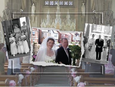
Dave Simm
The notes made by Dave Simm are set out below.Dave Simm
Church interior image: reduce contrast and lift brightness slightly, duplicate layer to be worked on later. Placed guide line @50% so I could be aware of the page crease.
Bride and father - centre image added, Bellwood torn edge and discarded Bellwood's background. Cut away the image that overlapped the edge effect.
Two remaining images converted to B+W still as RGB however, dragged the two images into the church canvas and scaled both at the same time. Brought in the centre image and scaled that down too. Then, selecting the duplicate church layer, I drew a rectangular marquee 2" in from the edge, inverted and deleted, drew another at 2.25" and selected Layer>Layer Style> Bevel and Emboss, set the depth to 25 and clicked OK next, using marquee again I removed the two sides of my bubble effect. then merged the two B+W images onto one layer added a bevel and emboss at 15."
Total time about ten minutes.
Page size 16 x 12 continuous bind vertical book.
I took the hand from the register signing pic and enlarged it to make part of the back ground, I then added a stock template that I had made a while ago, using the Gradient Tool I blended the one into the other and that is now my working canvas for the page.
I then added the rest of the register signing images and rotated to create interest, finishing up with bevel and emboss for a 3D look.
Five minute work time.
Comments:
The backdrop of painted terraced house is a real killer. They are bright, angular, ugly and immovable! There are two options - to kill the background colour or kill back both sharpness and colour. Neither can make much impression and costs about 10 minutes of work time - welcome to the world of urban weddings! Do we like the bevelled frame? Personally I think it clashes with the gothic architecture of the church.
The enlargement of the bride's hand has revealed masses of over sharpening, probably not evident at the original scale. The blend to a textured backdrop allows the triplet of images to stand out. The angle adds a greater dynamic to the composition and the different scale adds interest. Could we afford to "light" all the votive candles? - love the Registrar's sandals!


SWPP - Society of Wedding and Portrait Photographers
The Society of Photographers
Clwyd Chambers, Clwyd Street, Rhyl, Denbighshire, LL18 3LA, UK
Tel 00 44 (0) 1745 356935
Home Page - Find a Photographer - Benefits of Membership - Events and Seminars - Who's who - Photographic Trade Directory - About - Qualification Structure - Mentor Me Programme - Professional Imagemaker Magazine Articles - FREE information pack - Privacy