articles/Portraiture/calum-page2
Rolling with the BIG Dog - Calum's portrait - part 2 of 1 2
by Damian McGillicuddy Published 01/08/2013

I wanted my portrait to be free of 'filling' and 'window dressing ' and to engage straight with the subject so decided to strip everything away apart from the absolute necessary and key elements of the image.
Keeping with the simplicity I selected a plain, flat-painted wall as my background and Cal was positioned approximately 18 inches off the background as I was conscious that I wanted to use the shadow his body would cast as part of my overall composition.
Styling-wise: again I chose simplicity, keeping within my theme. The simple white towel hanging off shoulder, the wet, slightly tousled hair and the direct slightly sad look all add up to give the image a simple power, energy and direct 'hug' me message! The feeling in this image is just as important as the technical aspects and they conspire handin-hand to create an image that I genuinely believe is greater than the sum of its parts.
Technically I started where I always do with my trusty hand-held meter.
I took a light meter reading of the ambient light in the room. This would drive my shutter speed selection as I wanted to use the ambient as my fill light. The intention was to just use one artificial light to follow the 'minimum kit ' ethos I'm peddling at present.
I'm having a mini love affair with Olympus kit at the moment and one of bonuses of shooting with Olympus E series cameras is the stunning in built image stabilisation which really helped me shoot this at 1/25 of a second!
Selecting a light modifier for this shoot was quite simple. To followthrough with the scene I needed soft light. It still needed to have shape and direction so lets not confuse soft with flat ;0)
The 36" McGillicuddy BIG dish multi modifier was the perfect tool for this job as it balances beautifully portability with the quality of light that this image needed. I set it up not as a beauty dish but removed the inner deflector and replaced it with an inner baffle to spread the light and turn it into a quality soft-box. The light was further softened by the outer diffusion screen. Please note, though, that I selected the circle-shaped diffusion screen to give myself the biggest, most natural shaped catch lights in Cal's eyes.
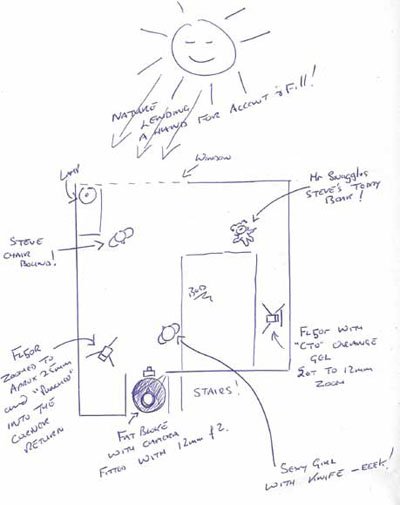
You can see the transformation in these two behind the scene images, it literally takes 30 seconds to go from one to the other! I wanted my focal point to be those stunning blue eyes and the mask of Cal's face so I determined to shoot with a shallow depth of field so it was just my intended focal point that was truly sharp. You will notice that the towel and even the subject's ears aren't critically sharp and that enhances the face further. So I only needed a 'blip' of flash to overpower the ambient and for it to become the main light in my image ... f3.5 it is then... sorted!
Olympus make some STUNNING optics and the quality of the files their cameras produce just give beautiful tonality, especially in the skin.
I decided that I should go with a classic lighting pattern as it would suit the image intent and chose 'Rembrandt ' for its sculptural quality. The 'key ' light was placed to camera-left and at an angle of approximately 45 degrees to Calum and about 35 degrees above his eye line. In essence I'm looking to create a triangular patch of light on the cheek furthest from the 'key ' light. The light was then 'feathered ' back so just the edge skimmed across the subject creating relief and the illusion of depth in my image.
Et voila! it was really that simple, the shoot took just 15 minutes from set up to completion and really was that simple and straight forward ... it really isn't rocket science! I wonder if they ever say that at N.A.S.A? ;0) (No they don't I've worked with them! Ed.)
Any post:
The image was converted to black and white within Aperture and the usual 'tidying up ' of stray hairs and skin imperfections was carried out.
The image was then run through onOne software's Photo Tools 2.6 (this is FAST becoming a habit!) where I gave it a Gold Tone then reducedthe vibrancy of the effect. I then ran the 'edges to black function' to hold the viewer's eye within the frame and give an outer rigidity to my composition. This line used to be known as the photo journalists 'line of integrity'. In other words it was the edge of the neg this showed the viewer that the journalist was portraying the 'truth ' within his image and nothing was being hidden or manipulated. A message I was keen to portray within this study so felt it was an appropriate gesture.
From this session I also took another frame, where the towel was wrapped tighter and the lines within itself were used compositionally to create dynamic diagonals and post produced it slightly differently to show you that there are more than just the one way to skin a cat, even though the capture technique is identical.
This image had the compulsory cloning done as is my norm. Then I subtly and slightly desaturated the file slightly to give me the soft, muted pastel hues reminiscent of old film. Before adding my black 'line of integrity ' I further enhanced the antique feel of the image and the yellowing of the background by running a texture over the top of the image in Photo Tools 2.6 which again I made more subtle within the software by 'fading it back'.
I hope you enjoyed this instalment as much as I enjoyed writing it. I look forward to seeing you all on one of my future workshops were I can SHOW you that it's really easier than you think to achieve beautiful photographs.
Please Note:
There is more than one page for this Article.
You are currently on page 2
- Rolling with the BIG Dog - Calum's portrait page 1
- Rolling with the BIG Dog - Calum's portrait page 2
1st Published 01/08/2013
last update 09/12/2022 14:52:06
More Portraiture Articles


