articles/Printers/canonpixmapro1-page2
Canon Pixma Pro-1 - part 2 of 1 2 3
by Mike McNamee Published 01/02/2012

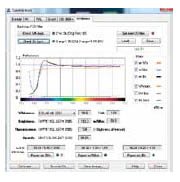
The paper white analysis of Platinum Gloss indicates the high OBA activity (the bump in the top, red graph trace) to produce a very cool but bright image rendering.
Metamerism Just when you might think you have a clean, neutral print, metamerism rears its ugly head to disturb the unwary. Metamerism reveals itself as a change in tone when a print is viewed, for example, in room light and then in a conservatory. Any undue shift in the perception of the neutrality in the print is the result of metamerism. Strictly metamerism refers to a 'pair' of colours which match in one sort of light but not in another - the typical conundrum facing the ladies when they try to match a handbag and their new frock. They might match in the shop but do they match when taken outside? At Professional Imagemaker we have been using the more correct Colour Inconstancy Index to define the potential for colour shift in different illumination sources as this does not require a pair of colours, only one. The measurement is the same as other colour errors, we use ΔE00 as it is more accurate. The eye can detect a 1 ΔE00 colour shift under ideal conditions. In addition you have to specify the tone being measured (we always use 50% grey) and the two illuminants (we use D65 and Tungsten A). It's a shame it is so complex but hey ho, that's life and we have to live with it! CII values of between 2 and 3 ΔE00 are regarded as the 'best-in-class' at the moment from the top-end ink sets.
Mono Peformance of the Pixma Pro-1 The Pro-1 has five black options to bring to bear on mono printmaking: Matt Black, Photo Black, Dark Grey, Grey and Light Grey.
The Matt Black and Photo Black are used (automatically) on matt, art papers and gloss/lustre paper respectively. No ink changes are needed when changing from gloss to matt media, the switch-over is seamless, though the media selection. It was not possible to confirm the changes in coloured ink use as Canons do not have an ink usage utility in their drivers.
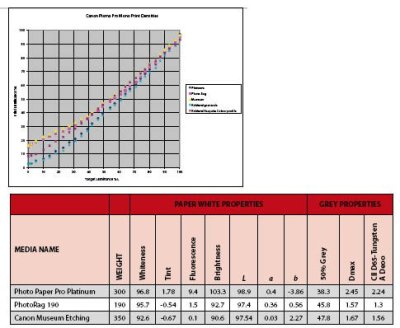
In view of the discussion above and on paper whiteness at the end of this feature, we publish a table showing all the properties pertinent to monochrome performance.
The art papers performed excellently, nailing the mid-tone density to within around 5%. However, all the prints were a little dark, the Platinum gloss by almost 12% . This made for very rich-looking prints and good Dmax values. All the prints were mapped reasonably close to the base tone of the paper and very pleasant for that. The metamerism was lower than the values recorded with full-set, 'colour' prints which suggests that the metamerism is more under control with the black inks only.
We also checked out the metamerism of the near neutrals to gauge the effect of a slightly toned result. This had to be done using a full colour test print but it does show reasonable control over metamerism as colour is introduced to the greys. There is no direct equivalent of the Epson Advanced Black and White driver and so toned effects need to be created in Photoshop, followed by colour printing. Making 'monochromes' this way brings the metamerism back to the colour-based values but there are no obvious distortions or problems in doing so.

The graph confirms the observation that the default settings for gloss papers are producing a dark print. The Platinum (blue diamonds) and Kirkland Gloss (blue crosses) are too low by around 10% in the mid-range greys. The lift in the matt art papers so that they maximise the blacks at about 15% is normal and reflects the final Dmax achievable on these papers.
Please Note:
There is more than one page for this Article.
You are currently on page 2 Contact Mike McNamee
1st Published 01/02/2012
last update 09/12/2022 14:52:08
More Printers Articles


