


articles/Digital/colouradjust5-page1
by Mike McNamee Published 01/05/2003
In our continuing series on colour correction we look at the problems associated with correction of real images, in which the adjustments have to be tuned to the known characteristics of the printer/paper/ink combination.
There is a huge difference between performing (or watching) colour correction at a seminar and the real world of colour correction. Usually at a seminar the speaker has worked though the correction beforehand and has a reasonable handle on what is going to be needed to achieve a satisfactory result. The reality of facing an image for the first time is a little more complex and can require a couple of starts before the desired result is achieved.
The example we chose to show here is typical. Originally, artist Carol Tipping had created her image and printed it to her satisfaction at A4 on an Epson 1290. The print matched the screen and she liked the result. To your Editor's shame he did not properly examine the image in Photoshop before committing to the printing of a 30" print onto the rather expensive Epson Somerset Enhanced, a 500gsm archival board material. The first print out was massively blocked up in the shadows with all the gorgeous brushwork completely hidden and not what the artist had intended at all. Suitably chastened we went back and followed the advice we always give out - look at the number values of the colours before you start.
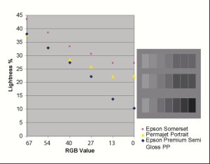
The eyedropper was set to 5x5 average (ie 25 pixels per measurement) and run around, over the dark folds of the clothing. This revealed that none of the RGB values got above 30 points and many were down at 5 points. We knew from our profiling and ColourAudit data that such values printed as fully dense black and had we had the foresight to measure first we would have realised!
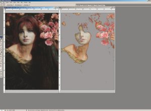
The trick is to make an Adjustment Layer for curves and lift the density of the darkest tones until they are no longer blocked and therefore start to print. If you have made and printed a grey scale as described in part 3 of this series you will have determined which RGB values (if any) fail to differentiate. This tells you which values to avoid in your image if shadow detail separation is required. The problem is particularly acute with Somerset (and other) fine art papers, which tend to absorb ink deep into their structure (see the boxes). We limited the black output values to 21 RGB points by lifting the left hand base of the curve upwards and shown in the screen grab. Carol did not want the face of the girl or the roses to be lightened and so the mask (which is provided by default with an Adjustment layer) was painted with black and dark greys to protect those parts of the image from being lightened by the Adjustment Layer.


SWPP - Society of Wedding and Portrait Photographers
The Society of Photographers
Clwyd Chambers, Clwyd Street, Rhyl, Denbighshire, LL18 3LA, UK
Tel 00 44 (0) 1745 356935
Home Page - Find a Photographer - Benefits of Membership - Events and Seminars - Who's who - Photographic Trade Directory - About - Qualification Structure - Mentor Me Programme - Professional Imagemaker Magazine Articles - FREE information pack - Privacy