articles/Monitors/eizocg241wmonitor-page2
Eizo colouredge cg241W monitor - part 2 of 1 2 3
by Mike McNamee Published 01/12/2007

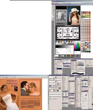
There is space for both Photoshop and Bridge if you wish.
In portait format you can have an A3 portrait with space to spare for palletes at the base - we found this rather too tall for comfort when image manipulating, but it would look impressive when showing clients their images.
Magazine designers will love the ability to have a double A4 spread on the Eizo and a separate second screen for all the palettes of InDesign or QuarkXpress.

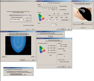
The seven-click Color Navigator dialogue is simplicity itself, a joy to use.
Is it worth it? It has to be said that as we go about the country we come across some pretty ghastly monitors. All in the lower price bracket tend to be massively over bright, designed, as they are, with the gamers in mind. When you attempt to drop the brightness back (typically from 350cd/m2 to 95cd/m2) they either will not do so, (because they don't have user-adjustable Look-up Tables (LUTs) at all), lose accuracy or, in the worst instances we have seen, posterise and band the image. A few we have attempted to calibrate were totally compromised by attempting to calibrate them, with huge swathes of banded tones across dark hair for example - we are not talking poor here, we mean ghastly, unacceptably ghastly! By the same token we can find you a number of members who are operating Dell UltraSharps as a successful part of their workflow. In the main these users have mentally adjusted to the mismatch between screen and print and got on with it.
In summary then, your extra money buys a larger screen, higher resolution, a larger gamut and an accurately controlled luminance and colour temperature. If your budget is limited you are better going for a physically smaller model and pairing it with a lower cost (£100) second monitor to hold your Photoshop palettes and create more desktop area (of monitor that is). At 24 inches the CG241W is pushing the limits; with a close working distance the angle to the outer edges is quite acute and there is a detectable difference in the appearance of the image. In real terms you see about 10 or 15 more RGB points of separation in deep shadows by moving your head to the side of the screen. A second, separate monitor can be placed at an angle to the primary screen, so that your eye-to-screen distance is maintained. A counter argument to this is that you can sit further away from a larger monitor.
Color Navigator
This software is a dream to use. The instruction leaflet is a masterpiece of brevity - 'Follow the onscreen instructions'. That indeed is what you do, and seven mouse clicks later you should find yourself in front of a calibrated screen. We aimed at 6500°K and got 6509°K, a luminance of 95cd/m2 and got 95.1cd/m2. After saving the profile you can lock the setting down and let Fido off his lead - there's nothing more to do!
Please Note:
There is more than one page for this Article.
You are currently on page 2
- Eizo colouredge cg241W monitor page 1
- Eizo colouredge cg241W monitor page 2
- Eizo colouredge cg241W monitor page 3
1st Published 01/12/2007
last update 09/12/2022 14:53:44
More Monitors Articles


