articles/Printers/epsonrstuylusprok3-page9
Epson Stylus Pro UltraChrome K3 Printers - part 9 of 1 2 3 4 5 6 7 8 9 10
by Mike McNamee Published

The error in the deep blues is worthy of mention. This is almost always the highest error in the Macbeth colours, running out to some 20 points on occasion, even in a nominally good profile - the eye is actually quite insensitive to errors in this part of the spectrum. In the bespoke and SP profiles the error was around 4 Lab points compared with a more normal 14 points for the Pro profile. It is a curiosity we may well look into during our extended testing of the printer.
Despite all these statistics, all the audit prints looked good and only the skin tones of the Pro profile would require a little tweak if you were printing to exhibition standard. For general commercial work you would probably just get on with it.

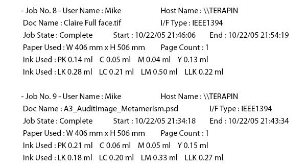
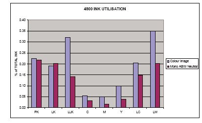
Mono prints We made a mono print with the settings at neutral in the ABW. The quality - the combination of high gloss, rich blacks, open highlights and detail - was quite outstanding, unquestionably the best that this reviewer has ever seen off any printer. The metamerism was low, peaking at about 1.6 Lab points around 70RGB points and falling lower through the mid tones and highlights. The ink utilisation data shows the percentage of each type of ink used in making mono images compared with colour. The ABW still uses quite a lot of Light Cyan and Light Magenta but far less of the full-colour inks.
The cost per square foot in ink is slightly higher than the colour image tested but this is almost certainly due to the slightly low key tone of Paul Gallagher's image (see the next page).
Please Note:
There is more than one page for this Article.
You are currently on page 9
- Epson Stylus Pro UltraChrome K3 Printers page 1
- Epson Stylus Pro UltraChrome K3 Printers page 2
- Epson Stylus Pro UltraChrome K3 Printers page 3
- Epson Stylus Pro UltraChrome K3 Printers page 4
- Epson Stylus Pro UltraChrome K3 Printers page 5
- Epson Stylus Pro UltraChrome K3 Printers page 6
- Epson Stylus Pro UltraChrome K3 Printers page 7
- Epson Stylus Pro UltraChrome K3 Printers page 8
- Epson Stylus Pro UltraChrome K3 Printers page 9
- Epson Stylus Pro UltraChrome K3 Printers page 10
1st Published
last update 09/12/2022 14:53:59
More Printers Articles


