articles/Review/epsonstyluspro4880-page3
EPSON Stylus Pro 4880 - part 3 of 1 2 3 4
by Mike McNamee Published 01/12/2007

We extended the colour set of our audit target to include the colour used by FOGRA-Gracol for proofer and contractproofing compliance. Although we did not strictly follow the protocols, we achieved data that would pass FOGRAGracol standards without using a RIP. Once the engineers at GMG get things organised, we might expect even more spectacular results from their RIP and the 4880.
Some Difficult Colours
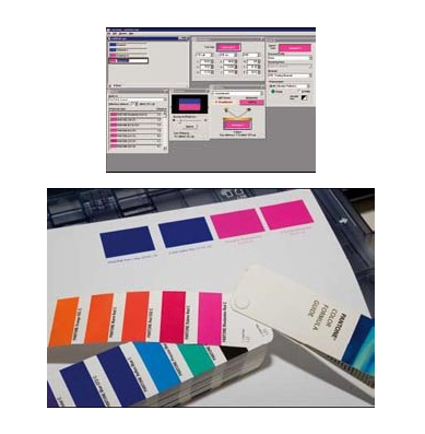
Claims were made at the launch for a capability of making an accurate Pantone Reflex Blue and Rhodamine Red. These are two spot colours that are quite a long way out in the gamut space and are traditionally difficult, to accurately proof. The actual colour coordinates for Reflex Blue are a bit vague; we have different values from Photoshop, X-Rite and Pantone. However, even though the differences between these three were greater than the accuracy demanded by contract proof standards, we found in our testing that the measured colour off the printed sample always brought up Reflex Blue or Rhodamine Red as the first or second choice in the matching software. In other words, the Vivid Magenta can do the job, just as soon as we can unscramble the variable specifications! We got within 0.7 ΔE Lab on one test (Reflex Blue) and 4.7ΔE on another (for Rhodamine Red).

"... if you are new into the market, the 4880 remains at the top of the wish list in the 24 inch category"
Epson Traditional Photo Paper
Known in the USA as Epson Exhibition Fiber Paper, we obtained profiles built by Pixel Genius (www. pixelgenius.com/epson/) for use with this paper/printer combination. It is a big (2.8Mb), high-resolution profile made using 5202 patches, a heroic piece of profile building - we hope they have an automatic instrument!
Colour Performance
The gamut volume for the profile was 891,327. Our first print was slightly damaged by the passing print head and we experimented with paper thickness and platen gap in the 'Paper Config' until we resolved the matter. We found that using a paper thickness of 0.4mm and a 'wide' setting for platen gap solved the problem.
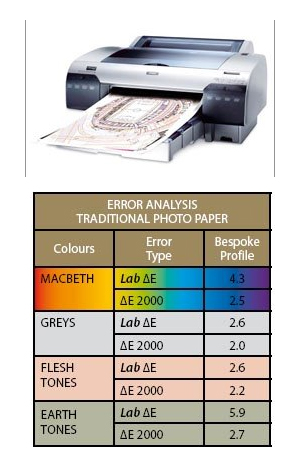
The print made using the Pixel Genius profile was very slightly yellow (but only by half a Lab point) and this, combined with the coolness of the base paper, made for a slightly creamy rendering. The average errors are tabled and are typical for the quality we have come to expect from a baryta paper (see elsewhere in this issue). For a non-bespoke profile the data are excellent.
The bulk of the errors lie in the Lightness channel, our pre-production model seems a little dark overall.
Mono Performance
As Traditional Photo Paper is being billed as a 'monochrome performer' we looked at the combination with the 4880 in some detail. The Dmax was high at 2.33. The greys were clustered around the yellow quadrant, on or just above the pure neutral point. In combination with the cool base of the paper, this left them a little yellow-looking, but we are talking very small amounts here. The linearity of the tone range was excellent right down to the shadows although the shadow area blocked quite quickly, immediately after the 20 RGB point was reached.
Please Note:
There is more than one page for this Article.
You are currently on page 3
- EPSON Stylus Pro 4880 page 1
- EPSON Stylus Pro 4880 page 2
- EPSON Stylus Pro 4880 page 3
- EPSON Stylus Pro 4880 page 4
1st Published 01/12/2007
last update 09/12/2022 14:54:00
More Review Articles


