

articles/Colour Management/getting-studio-quality-images-page1
Published
Capturing CorrectlyNowadays the abilities of us all to capture studio quality shots has been made more available by the reducingcost and increasing quality of digital cameras. Gone are the days of limited ISOs and needing the rightfilm for the right type of shoot as many aspects can simply be corrected or emulated (film grain and contrastfor instance) in post processing software such as Adobe Lightroom or the many specific, effect plugins forthese parent softwares (e.g. Google / Nik Software's Color Efex Pro etc). These effects are subjective and goodimplementation relies largely on the experienced retoucher's eye to get the best out of the relevant filters andimage adjustments without overdoing the end result. Something that isn't subjective though is the coloursof your subject. In some instances latitude can be allowed but when the colour of the subject is crucial (e.g.the football team's livery, the model's lipstick or the bride's gown) then we need to have a solution to solvethis colour connundrum. It may seem an easy thing to think that you can recall the relevant colours of yoursubjects from the day of the shoot, but that's a big ask. Was it an ivory dress or cream? Was the uniform black,blue or grey? When your living, reputation or simply peaceful homelifedepends on getting things correct and it's all too easy for thedress to be waved infront of you later by an irate customer (or worse,a relative) then you need a solution. Fortunately all we really need todo is have a frame of reference.
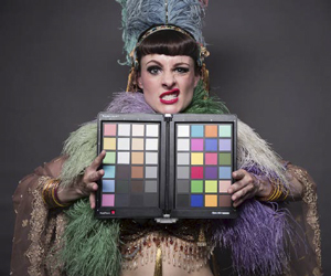
Initially this was managed by dropping a grey card into your shootsand taking a shot to later set white balance against. Whilst this isdefinitely a step in the right direction really all you can do in thissituation at best is remove any overall colour casts and set your exposureand contrast correctly. If you need to get all your colours spoton then you need a colour chart to shoot that has as wide a range ofcolours as possible that you know the values for. Fortunately companies such as Datacolor make such charts.Colour Charts have been around for many years but only with the introduction of the simple to use pluginthat comes with Datacolor's SpyderCHECKR have they become practical. Previously you could shoot a chartand take it into your retouching software, but you'd need to know all the colour values for the chart's patchesand then use your retouching tools to adjust the patches to read correctly. In changing the colour readings forone patch you'd inevitably have an effect on the other patches making it either an unending game of chase thecolour or you'd have to just decide which colours you needed right and settle for the rest being out of range inorder to get that crucial dress or make-upcolour just right
Fortunately the SpyderCHECKR App thatcomes with Datacolor's range of colourcharts reads all the patches and creates acorrection for every reading simultaneouslytaking the manual element out of theprocess and simply producing a correctionPreset that can be applied to any imagewithin such programs as Adobe Lightroom,Photoshop Bridge and Hassleblad Focus. Of course the key thing to remember is to take a new shot of thechart to perform this calibration from, in every lighting condition you are in for the shoot. Fortunately thejoys of digital photography mean that this isn't a waste of film etc, it's just another shot. More practically, youdon't have to get your subjects to hold the target at the time of the shoot.
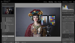
If you can get the Formula One driver to position the SpyderCHECKR on the bonnet as he zooms passed, allthe better, but realistically as long as you take a shot at some point in the day in that lighting condition, thenyou have your frame of reference. So don't despair, if you forget to take a shot in the Church before taking thegroup scenes outside then just nip back in and take a shot later - just make sure you apply the correct presetadjustment to the relevant images. For personal preference this is one of the areas where Lightroom comesinto it's own. Applying the correction tomultiple images shot at the same time issimply a case of selecting all the imagesand hitting the relevant Preset button.Moreover, you can easily group all Presetsfor a shoot into a folder and even exportand save these with the relevant archivedimages.
Other practical considerations to takeinto account are useability. Datacolorproduce two Colour Charts, the fullblown SpyderCHECKR and it's entrylevel brother the SpyderCHECKR24. Sizedoes mean everything though as youneed to be able to drop these into your subject area without needing to zoom vin to see them in camera andhence give a false meter reading for the scene that you're shooting. Fortunately both charts have roughly A5sized cards (one in the case of the SpyderCHECKR24 and two for the SpyderCHECKR) with around 1 inchpatches making them easy to capture and use to calibrate your scene even in the biggest group shots. Whilstboth are light and easy to stow away in a camera bag, the entry level SpyderCHECKR24 comes with the chartin a robust plastic envelope. The bigger SpyderCHECKR has double the colour patches (with an extra chartspecifically for pastel / skin tones) and comes in a hard plastice case that folds in two, ensuring the cards arewell protected. This case also comes with a tripod mount to ensure that you don't just have to lean the chartinto your work or ask your subjects to hold it, but instead can be popped in at any stage on it's mount anddropped into the shoot.
But of course the story doesn't just end with shooting still images. Nowadays we are perhaps at least allstarting to dabble with video and fortunately the SpyderCHECKR not only works with its SpyderCHECKRApp for stills' calibration but can also be used with softwares such as BlackMagic Davinci Resolve to calibratevideo. Just drop in and capture the chart for a few frames within the filming. Also as the cost of 3D printing isreducing the SpyderCHECKR is also proving invaluable as a reference chart for 3D Scanning as well. Whenthe cost of your 'Print' is a few hundred pounds as opposed to the cost of a 2D print, then you really need toget the colour correct!
So there's how to capture the correct colours of your images covered. Of course if you want to retouch yourimages be able to trust what you are doing is how they will come out in print, on the web or elsewhere then atthe very least you need to have a calibrated display to work on or for preference also be calibrating your ownprinters and paper. For more on this see our next article "Getting Studio Quality Images (Part 2 - What yousee is what you'd really like to get... please?)".
Images are courtesy if Tigz Rice Studios (www.TigzRice.com). To see a recording of this Burlesque PhotoShoot with photo, retouching and colour management sessions from Tigz Rice and Richard West with modelTalulah Blue


SWPP - Society of Wedding and Portrait Photographers
The Society of Photographers
Clwyd Chambers, Clwyd Street, Rhyl, Denbighshire, LL18 3LA, UK
Tel 00 44 (0) 1745 356935
Home Page - Find a Photographer - Benefits of Membership - Events and Seminars - Who's who - Photographic Trade Directory - About - Qualification Structure - Mentor Me Programme - Professional Imagemaker Magazine Articles - FREE information pack - Privacy