


articles/Colour Management/getting-studio-quality-imagespart2-page1
Published
What you see is what you'd really like to get... please? So we've all been there. We've seen a picture of ourselves / a friend / your Mum / someone you admire in the Newspaper. We realise that much as it looks washed out, grainy and overly saturated, we know that the original shot probably wasn't as bad as all that. Let's face it, Newspaper paper has always been renown for its cheap and absorbant qualities - why else would we wrap fish and chips in it? So we know it's low grade and we therefore don't expect to see any image looking great in it... So if you've ever said 'Compared to how I see it on my computer screen my image has come out looking nothing like that on my printer, or in this magazine, or from that album company...' then maybe you should think back to the Newspaper situation.
If you have printed out your images on more than one type of paper you probably already have an idea of what works well for your types of images. This can of course be subjective but generally it's accepted that perhaps a silk / satin stock is excellent for creating velvety blacks and soft whites for landscapes, a pearl / lustre stock can be great for high contrast black and white, and a gloss really helps with colourful fashion work. So why when we go to print our images out do so few people actually soft proof the end result first to check this output effect?
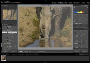
Soft proofing is your means of emulating what your images will look like when output in different situations. It's a feature built into most accepted imaging softwares and simply allows you to simulate the output conditions and particularly the colour capabilites, of your intended printer or viewing device. Sounds simple? It is! Probably the easiest to use software for this is the now almost ubiquitous Adobe Lightroom. With the full computer based version you only need to go into the Develop Module (i.e. the image retouching part) and click the tick-box marked 'Soft Proofing'. Invariably I find, when I ask the question at live events, that very few if anyone has done this or if they have, they don't know what it does.
If you do click the button a dialogue box appears under the Histogram (the graph) in the top right had corner of the Develop window. You can then choose what output to simulate in the new 'Proof Settings' window. Chances are, if you haven't chosen any output profiles before then you'll have this set as default to sRGB and hence probably won't see any difference before or after ticking the box unless you are on a screen that can show Adobe RGB (e.g. an Eizo or Wacom Cintiq 27"). If you click on 'Profile' then you get a list of any profiles that are already set up to use in Lightroom or you can choose new ones that you have on your computer by clicking 'Other' and ticking those you want to see from the list. A profile is a very small file (c. 1-2 MB) that contains details of the colour space of the relevant device. In the case of profiles of printers, this includes the effect of paper, ink and the print device and allows this visual emulation of the end-result (colour only, not grain of stock etc). This is the key part togetting your output (in particular in print) looking as near as you can to what you see on screen. Any effects on colour due to the paper, ink and printer are emulated so if you have a combination that will give a more contrasty or softer or more washed out effect, you should now see it. The simple choice for you then is to decide if you like it or if you want to adjust the way the image is appearing in Soft Proof, which ultimately will effect the end output. The benefit of Lightroom is that any corrective adjustments to get your images looking the way you want them to as opposed to how the soft proof initially shows the end result, can be saved as a Lightroom Preset and then easily applied with the click of a button to any other images you choose to be output to the same device and therefore most likely needing the same adjustment.

Hopefully this has now unlocked a major step in getting your images looking the way you want at output and most hopefully (depending on the quality of printer), as near as possible to how you saw them on screen in the first place. If you have a software that allows soft proofing the only additional element you need to achieve this is a means of creating the profile files (i.e. the small description files). The most accurate and easy way to do this at an affordable price is via the Datacolor SpyderPRINT. This device allows you to print out test charts from its accompanying software (Mac or Windows) and then use the USB based device to read the charts. Reading is made easy with the included positioning frame, allowing you to click once at the start of each printed line of test patches and simply slide across to read all the patches in that line. Once you've worked your way through each line of the charts the software does the rest of the work, calculating the Colour Profile of the output that you are reading and creating the relevant profile file and even saving it straight into Lightroom or Photoshop etc for you to select for Soft Proofing. Each nuance to the image colours due to different papers, inks or print devices is captured in this way and ready to emulate.
Of course, when you are soft proofing your results to see the emulation of the end results the other key element to consider is the screen you are looking at. This needs to be showing you the 'True Colour' of your images. Fortunately this is not a subjective measurement as the International Colour Consortium (consisting of representatives from Apple, Adobe, Microsoft and other colour focussed companies) have set a standard to calibrate your devices to. The Profiles that the SpyderPRINT create are already calibrated to this ICC standard, so all you need is a screen calibrator like the SpyderPRINT's sister product, the ubiquitous Spyder (recently updated to version 5 to handle 4k, 5k and curved screens), and you can calibrate your screens and other devices driven by your computer (TVs, Projectors etc) to allow you to retouch and soft proof to your heart's content, knowing that 'What you see really is what you get'.
Images are courtesy if Tigz Rice Studios (www.TigzRice.com). To find out more about soft proofing in different softwares, see how to easily calibrate your screen even see a recording of a Burlesque Photo Shoot with photo, retouching and colour management sessions from Tigz Rice and Richard West with model Talulah Blue


SWPP - Society of Wedding and Portrait Photographers
The Society of Photographers
Clwyd Chambers, Clwyd Street, Rhyl, Denbighshire, LL18 3LA, UK
Tel 00 44 (0) 1745 356935
Home Page - Find a Photographer - Benefits of Membership - Events and Seminars - Who's who - Photographic Trade Directory - About - Qualification Structure - Mentor Me Programme - Professional Imagemaker Magazine Articles - FREE information pack - Privacy