


articles/Paper/ilfordgalerie-page3
by Mike McNamee Published 01/08/2007
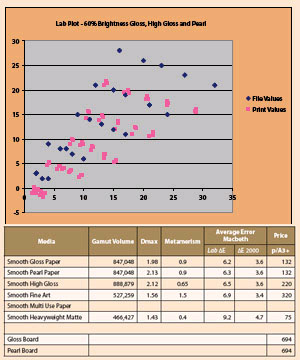
Once again the three data sets are superimposed, this time for flesh tone errors
The media is just on the cream side of neutral with a lightly textured surface. It is too thin for true giclee work, which ordinarily calls for 250gsm as a minimum weight. On test it performed consistently with other fine art media, good colour accuracy especially in the skin tones, depressed Dmax and a lower gamut volume than the gloss and lustre papers. The average error across the Macbeth Chart was 6.9 Lab ΔE/3.2ΔE2000. The flesh tones were mapped to the base neutral and so came in at an excellent 2.8ΔE2000 average error. Dmax was 1.56 and metamerism was 1.5 Lab points. The grey linearity curve bottomed out at 19% brightness and the shadows blocked at a slightly high 25 RGB points.
Smooth Heavyweight Matte paper
This is a double-sided 200gsm media. The profile was built using Single Weight Matte Paper as the Epson media setting, which limited us to 720dpi in the driver. As with other media of this type the colour accuracy was down on its more expensive siblings. The average errors were 9.2 Lab ΔE/4.7ΔE2000. The Dmax was 1.43 but the metamerism was surprisingly low at 0.4 Lab points. The Granger chart was a little less smooth than those of its companions. Overall though the test print was visually very similar to the more expensive offerings and this paper would act as good proofing media ahead of investing in a large fine art print.
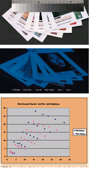
TOP: The main Galerie Professional range (excluding the Studio media) in natural light. MIDDLE: The UV-booth shows the differences in OBA loadings for the papers. Smooth Fine Art is optically dead in the UV light. Note that the Multi-use Paper has already started to show yellowing effects of OBA deterioration; there is a distinct rim around the exposed edges. BOTTOM: The error plot for the skin tones with Smooth Fine Art shows the data points to be mapped towards the neutral base white but overall the values are desaturated and rotated anti-clockwise (ie towards red). This was still a good data set though!
FINAL WORD
These are a particularly good set of gloss and pearl media; the consistency across the range in terms of colour response is quite remarkable, meaning that you can mix and match with no problems. The art materials are a little on the lightweight side for many applications and are expensive compared to their competitors.


SWPP - Society of Wedding and Portrait Photographers
The Society of Photographers
Clwyd Chambers, Clwyd Street, Rhyl, Denbighshire, LL18 3LA, UK
Tel 00 44 (0) 1745 356935
Home Page - Find a Photographer - Benefits of Membership - Events and Seminars - Who's who - Photographic Trade Directory - About - Qualification Structure - Mentor Me Programme - Professional Imagemaker Magazine Articles - FREE information pack - Privacy