


articles/Paper/ilfordgaleriegold-page1
by Mike McNamee Published

It has taken a little longer, but Ilford have now joined the fibre-based look-alike brigade with the launch of Galerie Gold Fibre Silk. With its sumptuous livery of purple and black, trimmed with gold, it certainly looks the part of a highquality, premium product and although we are looking at the generic rise of baryta-coated papers, we are giving the Ilford product the same consideration as we have given all its rivals.
Galerie Gold Fibre Silk is a 310gsm material with a baryta coating, intended to simulate the surface and print feel obtained with a gloss, air-dried, silver halide media - the very roots of Ilford's history in fact! It most certainly accomplishes this aim and the beautifully produced press pack (complete with white gloves!) contained some gorgeous, lustrous images, each imitating a conventional toning treatment of a silver halide paper. The media also remained perfectly flat through the Epson 3800 printer something that not all of its rivals could accomplish. It even smelled like a silver halide paper which was a bit spooky!
Base Properties
The media is 310gsm with a measured calliper of 320 microns. In natural north daylight it looks just a little creamy and there was no evidence of optical brighteners in either the UV-booth or from the spectral trace, indeed the spectral trace was almost perfectly flat from 360 to 690nm. The base paper measured a half point or so to the blue-magenta side of perfect neutral. The base fibre composition of the material is not disclosed in the literature, so we suspect that it is not cotton rag (which people would boast about) more likely an alpha cellulose
Colour Performance
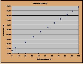
The media behaved in a similar way to other baryta-coated papers. The neutrality of the base delivers extremely accurate skin tones. The canned profile (downloaded from Ilford) produced slight desaturation all around the gamut and this was also true of the skin tones. The hue of the skin tones was a minute fraction rotated towards magenta but nothing that the eye could detect. The landscape tones were extremely good, a result of this material's ability to hold deep blacks and dark tones. The average error of the profile across the Macbeth swatches was 5.9ΔE Lab/3.15 ΔE2000, a good result for a canned profile on our Epson 3800 test-bed (using Photo Black ink, of course).
The gamut volume was 828,192. This was from Ilford's 288- swatch profile target and is bound to be a little lower than we could achieve with our own profiling target on more than twice that number of swatches. It is, however, in the right ball-park in comparison to its competitors. The Granger Chart was smooth over the entire gamut and there was no sign of bronzing or differential gloss. The printed surface is relatively fragile and needs to be handled with a little care. It seemed to be touch dry as it emerged from the printer.


SWPP - Society of Wedding and Portrait Photographers
The Society of Photographers
Clwyd Chambers, Clwyd Street, Rhyl, Denbighshire, LL18 3LA, UK
Tel 00 44 (0) 1745 356935
Home Page - Find a Photographer - Benefits of Membership - Events and Seminars - Who's who - Photographic Trade Directory - About - Qualification Structure - Mentor Me Programme - Professional Imagemaker Magazine Articles - FREE information pack - Privacy