


articles/Digital/labcolour-page1
by Mike McNamee Published 01/09/2006
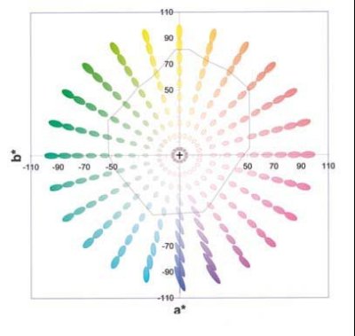
Colour has to be shown in a three-dimensional graph so that the colour and lightness may be depicted. However, to simplfy things the Lab plot is frequently shown in just two dimensions which is effectively a crosssectional slice through the 3-D shape. Lab is universal to all colour measurement. The lightness value is not shown in a 2‑D plot as it is on the third axis, coming straight out of the page; black is at the bottom, white is at the top. In a Lab plot pure yellow is at the top [+b], pure blue at the bottom [-b]. Green is to the left [-a] and red to the right [+a].
Also superimposed in this particular diagram are the discrimination ellipses. Note that they are small in the centre (easy to discriminate), large towards the pure colours and largest of all in the deep blues. The shape of the ellipses indicates that the eye is more sensitive to changes in hue (colour) than to saturation. Saturation value is represented by the distance from the axis (the cross in the centre). At the centre there is no saturation and so we have a neutral grey. As you move away from the centre the saturation increases. The hue changes as you move around the colour wheel (ie through the spectrum of colours, starting red, orange, yellow, green, cyan, blue, magenta and then back to red again).
Note also that the plot here is idealised and that the gamut of a real print is more complex and mis-shaped - this is what we call the gamut. A cross-section of the gamut is shown below as a light grey line. Note that it is much smaller than the surrounding plot; printers cannot make all the colours the eye can see. This in itself is one of the problems we face in managing colour.
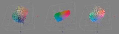
At the bottom we show the gamut depicted by the grey line in the plot, which is actually that of Epson UltraChrome on Permajet Fibre Base Gloss. The three plots show the actual gamut points in a 3-D visualisation, then a 2-D slice and finally the two combined. The grey line in the top diagram is what you see of the 3-D graph looking directly down on it from above.
Note we denote Lab by using semibold italics (Lab, L, a, b), others use stars, as in, L* a* b*. It is also denoted CIELAB by others.


SWPP - Society of Wedding and Portrait Photographers
The Society of Photographers
Clwyd Chambers, Clwyd Street, Rhyl, Denbighshire, LL18 3LA, UK
Tel 00 44 (0) 1745 356935
Home Page - Find a Photographer - Benefits of Membership - Events and Seminars - Who's who - Photographic Trade Directory - About - Qualification Structure - Mentor Me Programme - Professional Imagemaker Magazine Articles - FREE information pack - Privacy