articles/Business/look-insp-page8
Look for Inspiration - part 8 of 1 2 3 4 5 6 7 8
by Mike McNamee Published 01/08/2016

3. The use of thinner lines, triangles and expansive curves (original Bauhaus thinking assigned yellow to triangles, red to squares and blue to circles). See Thales Bopp.
4. The use of text on the angles but also around curves.
5. Splitting of text, with one syllable at small scale on one angle and the remainder at another angle.
6. A predominance of Futura typeface the archetypal font of the Bauhaus. In the mid seventies this was joined by ITC Bauhaus from Edward Benguiat although he adhered quite strictly to original Bauhaus principles. The Alba font was also mentioned in some of the searches and as it was already installed we used that for some of our example. The font Big Lou we picked up from the web.
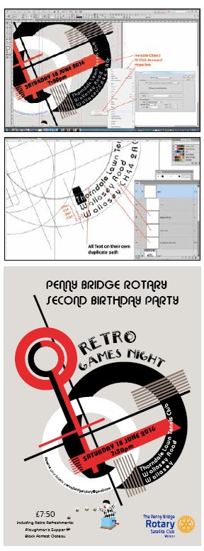
The final design could have been carried out in Photoshop, Illustrator or InDesign. We actually used all three and threw in some CorelDRAW for good measure. The background motif is a rough copy based on an outline by a Cambodian student Monika Ang. We started from scratch and drew up an Illustrator shape. This was then placed into Indesign from where the .ai file could be opened and modified at will. This flexibility is important if tricky text fitting has to be shaped into available spaces. We prepared the text without formatting in Microsoft Word partyly because we prefer the spell checking and have a bespoke spelling library for Word. This text block was copied in its entirety and pasted as a single block into InDesign. The text was then cut from this block and formatted as required - this tactic guarantees that nothing is left behind from the essential information, when the box holding the bulk text is empty, you are done! The Rotary logo was downloaded from their corporate website and brings its own colour swatches with it. As with many other organisations, Rotary publish strict guidelines about corporate colours and what you can and cannot do with the brand logo for example you never incorporate the logo as a wheel.
Text on paths
The ability to place text along a path is inherent in Photoshop, InDesign and Illustraor. Normally text within InDesign is auto-converted to an active URL when the file is finally written out to PDF with the 'Hyperlinks' check box ticked. However, text on a curve is not handled and so it was necessary to place an invisible object (ie no Fill and no Stroke) behind the text and assign a hyperlink to it. In the final PDF, clicking on the RSVP activates the reader's email client and auto-addresses an email back to the organiser. Clicking on the venue post code was hyperlinked to the website of the venue, from where detailed driving instructions and a map could be obtained.
Paths for text on a curve were positioned by copying the path from the object and then using Paste in Front which places the curve in exactly the same position. This was then converted to a text path and the required text pasted. To move the text from the edge of the circular object, the Baseline Shift is adjusted to 'push' the text away (downwards in this case) from the object edge. For three lines of text this process was repeated three times with increasing Baseline Shifts to space the text by eye.
Jack-in-a-box
The Jack-in-a-box was a piece of clipart from CorelDRAW 4 and was merged with a photograph of the dice in Photoshop. The motion blur was made using the 'Blur along a path' facility from Photoshop. The combined images were flattened in Photoshop and then placed into InDesign for final scaling and placement on the poster page.
We have not gone into the detail of making the background motif (it would take too long) but for beginners in Illustrator this type of project benefits from use of Paste in Front and clever use of layers and stacking order to place and then lock-up objects to prevent stuff from moving and also being inadvertently selected. If you come from Photoshop it is a different way of working. It helps if you plan out the sequence in which you create objects so that overlaps are correct and then divide your objects onto their own layers as needed.
In terms of deciding which application to use for a brief such as this, it depends on what you are used to, if you can justify the additional expense of having extra applications and how much effort you are prepared to devote to learning new software. The integration across Adobe products is such that you can effortlessly wheel portions of a design around between applications to exploit what each is best at. Having acquired the skills, they are marketable as you can add the graphic design elements on to your photography provision and thereby generate another income stream.
By background, most photographers are creative people and so a feel for graphic design should come relatively easily. Skill acquisition is just a case of grinding through the tutorials that abound the internet; there is very little that you cannot find these days!
Please Note:
There is more than one page for this Article.
You are currently on page 8
- Look for Inspiration page 1
- Look for Inspiration page 2
- Look for Inspiration page 3
- Look for Inspiration page 4
- Look for Inspiration page 5
- Look for Inspiration page 6
- Look for Inspiration page 7
- Look for Inspiration page 8
1st Published 01/08/2016
last update 09/12/2022 14:56:06
More Business Articles


