


articles/Monochrome/mike-mono-page7
by Mike McNamee Published 02/02/2015
Russell Brown's Method
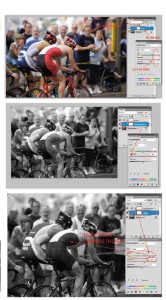
This is a method devised by Adobe Creative Director, Russell Brown. With the slider values at zero it produced an identical result to both the previous methods, including the artefacts in the yellows. However, its strength lies in the supreme flexibility of the conversion and the method cannot be eliminated from contention for that reason. If you examine the composite screen grab note that adjusting the Hue has altered the balance between the monochrome densities of the riders' lycra suits.
Here is the working recipe:
1. Open an RGB image.
2. Make an Adjustment Layer for Hue/ Saturation, but do nothing else at this stage other than setting the mode of this layer to 'Color, and changing its name to 'Colour'.
3. Make another Adjustment Layer for Hue/Saturation. Move the Saturation slider to -100 (the image changes to monochrome).
4. Focus the 'Colour' Adjustment layer by clicking on it. Make sure that it is located lower in the stack than the other HSB Adjustment Layer. Start moving the Hue slider and you will see the different colour values change their contributions to the monochrome tone value . You can move the Saturation and Lightness sliders to refine the adjustments as well. Note in the example that the rider's red lycra suit has darkened preferentially to say the other blue suit.
5. Fine-tune the conversion by clicking on the drop-down next to 'Master' and selecting a specific colour (eg Reds) and moving Hue Slider. This will only shift colours within the reds' colour range.
In addition, the technique supports Layer Masks. When you are satisfied with your adjustments you may flatten the image or save a Photoshop file to retain the individual layers and adjustments.
The Channel Mixer
The Channel Mixer gets a mixed press! Many practitioners seem to devote their time to developing methods to avoid using it. However, it has great versatility and, as the method may be readily converted into an action, it can be repeated and automated. Direct conversion to Grayscale takes a channel mix close to 30:60:10 for red, green and blue respectively, but this is infinitely variable.
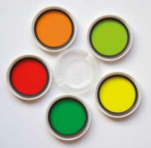
Traditional black and white specialists always carry coloured filters to 'bend' the tone response of their monochrome emulsions. This might come as a surprise to newcomers to photography who have been brought up on digital. The common filters and their historical uses are as follows:
Yellow - to darken skies slightly and cut through haze.
Orange - contrast of masonry and wood.
Red - even stronger than the two above, it can make deep blue skies almost black and bring huge contrast between cumulus clouds and clear sky.
Green - all the filters above darken green to such an extent that you can end up with nearly black foliage. A green filter can be used to lighten grass and foliage. Because it reduces the emphasis of red it is often used to improve a model's complexion in a monochrome shot. The larger manufacturers often provide different strengths of contrast filters, for example Nikon always made two green filters one for portrait work, the other for more general work.


SWPP - Society of Wedding and Portrait Photographers
The Society of Photographers
Clwyd Chambers, Clwyd Street, Rhyl, Denbighshire, LL18 3LA, UK
Tel 00 44 (0) 1745 356935
Home Page - Find a Photographer - Benefits of Membership - Events and Seminars - Who's who - Photographic Trade Directory - About - Qualification Structure - Mentor Me Programme - Professional Imagemaker Magazine Articles - FREE information pack - Privacy