articles/Composition/negativespace-page4
Negative Space Seeing What isn't There! - part 4 of 1 2 3 4
by Sofie Louca Published 01/10/2011

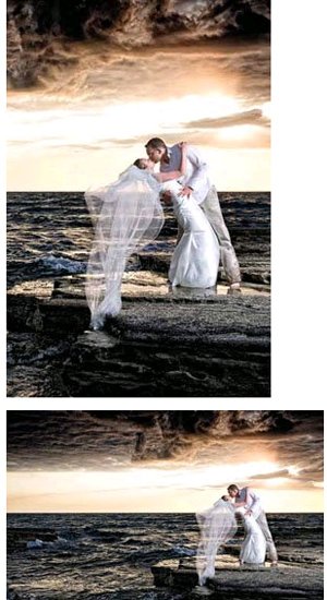
As photographers we have trained ourselves to see things that most others would miss but sometimes it's just as important seeing what isn't there or seeing what we can eliminate from the photograph! The empty space around your subject is just as important as they are. Sometimes we're in such a rush that we see what we think will be a great image but don't take the time to stop and think where best to position our subject or where the most suitable place is to take the shot from. The examples below shows that by moving your subject to occupy the empty space, the image automatically looks more balanced, the subject is better defined and stands out as the main part of the image.

We all know the phrase 'less is more' and this really can be the case. Just look at magazine ads for high-end advertising campaigns such as Versace, Chanel or Dior. The ads are simple, clean and uncluttered. On the other hand, look at low-end products and adverts that are cluttered with text and images, and make it hard for the viewer to get a sense of what they're about and give the impression of cheapness. What do you want your photography to say about you? Cluttered snapshots? Cheap and cheerful? Or simple, striking photography? Quality and well worth the money? Your images advertise you to your clients and speak, on your behalf, to your peers. Improving on your artistry and the style of your images not only gives you a sense of satisfaction and defines your style but works towards reaching a more discerning clientele as the consistent quality of your images characterise you as a professional photographer.
Please Note:
There is more than one page for this Article.
You are currently on page 4
- Negative Space Seeing What isn't There! page 1
- Negative Space Seeing What isn't There! page 2
- Negative Space Seeing What isn't There! page 3
- Negative Space Seeing What isn't There! page 4
1st Published 01/10/2011
last update 09/12/2022 14:56:55
More Composition Articles


