


articles/Paper/paperwhite-page3
by Mike McNamee Published 01/02/2012
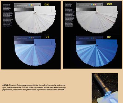
The entire Epson range arranged in the fan on Brightness value and, on the right, by Whiteness value. This crystallises the problem that we have when assessing paper whites ; the solution is to get the paper in your hand and decide for yourself!
What is Opacity?
This one is also easy to explain and uncontroversial. Paper is not opaque, it lets some light through. A very thin paper is not favoured for magazine printing because of 'show though' from the reverse side which can cause visible defects. Typically a solid-colour text box on the reverse side can show as a shadowy box on an image placed on the previous page. This does not concern the inkjet printer except that if the opacity of the paper is low (ie more 'see-through') then it will look darker if mounted on a black mount than if it were mounted on a white mount. Thicker art papers are more opaque and, in general, you will only run into trouble with opacity on very thin papers or those of less than 190gsm.
How do These Parameters Affect Real Prints?
This is, of course, the most important question. Viewing has to take into account the quality of light being used to look at the print. This can be very variable: from a domestic home; a dimly lit, intimate bar setting; a hospital consulting room; or a press-room floor. For the moment it is sufficient to say that viewing light quality is important and that you should carry on and read the section which follows on from this one; here we will content ourselves with observations on viewing under ideal, or near ideal, standardised viewing conditions.
Paper white is important for two reasons, a well profiled output will map the tones towards the paper white point and secondly the sophisticated onlooker is very sensitive to the tone of the paper, especially if the image is a monochrome. In general the average punter is less concerned and may not even notice at all. Another example - in a magazine such as ours the inks are very metameric, up to values of 5ΔE00, far more than we would accept when making monochrome exhibition prints - but nobody ever comments. We compare stuff in D50 light, the same as the press room and so everybody is happy!
In the previous feature on the Canon Pixma we compared the performance and gamut mapping of the same inks onto Canon Platinum Gloss* (very bright, high fluorescence) and Canon Museum Etching paper (slightly cream, no fluorescence and certainly no brighteners).
Looking at the graphs shows the effects on the measurements. The data are plotted around the colour wheel in Lab space on the next page. For hue, the errors are larger for Platinum Gloss, the points (blue diamonds) are generally further out from the original of the graph (the zero, zero point). The situation is then reversed for saturation (chroma) errors; here the red, Museum data are further out representing larger errors. This is entirely consistent. In lay terms the glossy nature of the Platinum paper has allowed higher saturation colour reproduction (more 'pop' as the Americans would say) but the colour accuracy (the hue) is compromised by the blueness of the paper. The reverse is true of the Museum, the colour errors (expressed as hue) are more tightly controlled because there is no interfering coolness, but the matt paper simply cannot create enough gamut to reproduce the high-saturation colours. This situation is exaggerated further with the HiGAM set of colours, right at the extremities of the gamut, the saturation error for Museum is 41⁄2 times that of the Platinum, ie it is even harder for the Museum to reproduce these very vibrant colours accurately.
* As shown by the plot, Museum Etching is not the creamiest of the papers and Platinum Gloss is not the coolest.
In answer to the question 'does it matter?' the following observation is generally true. Providing the viewing client cannot see the vibrant, glossy version alongside the more muted, matt version, they are unlikely to complain - this is something that photographers stress over more than clients. The only practical outcome might be that you could boost the colours of a skin tone, taking some blue out of a brightened paper image for a warmer, more pleasing effect. For high value, high life expectancy prints, the discerning print-maker would never touch a brightened paper.
The white paper provided by BabelColor should be enough to convince you of the importance of quality lighting: see http://www.babelcolour.com/main_level/Tutorials.htm
Viewing Conditions Accurate viewing of prints and, in particular, proofs is of such importance that there are a number of companies who specialise in little else. Print viewing for graphics is controlled by the ISO 3664. This only deals with requirements, not solutions. We first refer you to the publication by Babel Color to be found at http://www.babelcolour.com/download/Light_under_control_2005-11-08. pdf. This tells you, in detail, what to look out for and how to achieve it. The important features are:
1. A glare-free area of sufficient size.
2. The correct illumination, ie it is the correct (quite bright!) level for standardised viewing.
3. The correct colour temperature which may be one of several but must be known (typically D65 daylight, D50 press room, or various domestic and industrial fluorescent light conditions.
4. The quality of the light should be high. This is measured using the Colour Rendering Index and a value of at least 90 is required (100% is perfect, many domestic and commercial environments don't even reach 60 CRI units.)
Those of you who called in to see the print judging and qualifications adjudication during the Convention will have seen controlled viewing stands in operation. They were chosen partly so that the print handlers could move prints in and out smoothly and are normally equipped with side panels as well. Here is a short technical review of the GTI booths that we used.


SWPP - Society of Wedding and Portrait Photographers
The Society of Photographers
Clwyd Chambers, Clwyd Street, Rhyl, Denbighshire, LL18 3LA, UK
Tel 00 44 (0) 1745 356935
Home Page - Find a Photographer - Benefits of Membership - Events and Seminars - Who's who - Photographic Trade Directory - About - Qualification Structure - Mentor Me Programme - Professional Imagemaker Magazine Articles - FREE information pack - Privacy