articles/Paper/pc-hahn-slk-page3
Hahnemuhle Photo Silk Baryta 310 and Canvas Metallic 350 - part 3 of 1 2 3
by Mike McNamee Published 01/06/2014

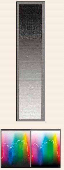
Our exploration of the puddling of ink did not lead us to a firm conclusion. As shown by the grey ramp at the top, the onset occurs coming into the 3/4 tones but goes away in the deeper shadows. The Granger Chart is similarly confusing in that there is a distinct boundary for the onset of puddling but nothing that correlates to colour parameters of the actual image suggesting that it may lie in the ink formulations called up by the printer drive
Hahnemuhle Canvas Metallic 350gsm
This, as far as we know, is a unique surface - a gloss canvas with a metallic sheen. Such coatings have been employed to great effect on PermaJet Titanium and Tecco Iridium but these are paper-based media.
Canvas Metallic was launched for The Photography Show with a carefully chosen 'art' image containing lots of rich golds - and very handsome it looked too!
There is little point in conducting our usual audit tests because the reflectance of the metallic coating fools the spectrophotometer. We used the icc profile from the Hahnemuhle website (HFAMetallic_Eps4900_PK_CanvasMetallic.icc for the record). After an initial media jam we opened the platen gap to 'wider'; this is quite a 'curly' media which lifts the sides of the surface as the roll comes though the printer. The media setting chosen was Premium Luster Photo Paper as per the instructions.
The solid colour patches of the audit target started to break up beyond Lab Lightness values of 35% (ie the dark end of the scale). The break-up is manifested as puddling of the ink in the craters of the canvas surface, between the warp and weft. The effect was quite pronounced in the grey ramp but also present in the following patches: 100% cyan, 100% and 70% blue, 100% green, 100% cmy and in six of the Macbeth CC24 patches. It was not present in either the yellows or oranges of the target.
In order to try to understand more about the effect, we plotted the boundary between puddling and no-puddling on the Granger Chart. From this analysis there is no reason to suppose that it is Total Ink Coverage or the Lab Lightness value which demarks the boundary; it is more likely to be a complex mix of where the cmy inks are replaced by full black inks (the so-called GCR, Grey Component Replacement and the Black Start position - parameters which are well hidden in the driver code!). The effect disappears at the very dark end of the colour scale as the craters become fully filled with ink.
Now this discussion has drifted a long way from real prints. Some may like the strength of the canvas texture showing through. To this end we asked Dianne Owen for one of her highly stylistic images which contains a lot of metallic blues (see http://dianneowen. info/). Despite the puddling this made a nice print. Having said that, the image with which the media was launched at The Photography Show was more suited because it contains mainly yellows and lighter greys, none of which puddle thus producing a more pleasing effect.
This, then, is a Marmite media, with the added twist that your preference or otherwise might depend strongly on the image. We showed some of the real prints at a specialist fine art printing seminar; they created quite a strong interest which is good news - the world is a richer place for the diversity of surfaces that we are offered!
Please Note:
There is more than one page for this Article.
You are currently on page 3
- Hahnemuhle Photo Silk Baryta 310 and Canvas Metallic 350 page 1
- Hahnemuhle Photo Silk Baryta 310 and Canvas Metallic 350 page 2
- Hahnemuhle Photo Silk Baryta 310 and Canvas Metallic 350 page 3
1st Published 01/06/2014
last update 09/12/2022 14:57:29
More Paper Articles


