articles/Paper/permajet-fb-range-page3
Paper Chase - The New Permajet FB Range - part 3 of 1 2 3 4
by Mike McNamee Published 01/10/2015

FB Gloss 310
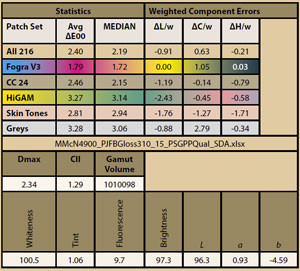
Royal Gloss occupies the middle ground of the FB groupin terms of its coolness. It is still a bright punchy paperthough. The gloss is a pleasant, classic Fibre Base sheen.It may have been due to the grain direction of this batchbut we experienced some head striking while printing.This is alleviated by widening the Platen Gap, a tactic thatis frequently called up with many papers utilising the stiffalpha cellulose base materials.
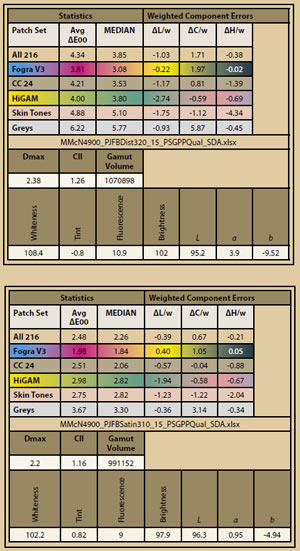
The colour statistics were lower (ie better) than average forall our paper tests, at 2.46ΔEoo for the Macbeth set. TheFogra CMYK patch set was noteworthy with a zero error inthe lightness channel. The Dmax, metamerism and gamutvolume were all excellent.
FB Satin 310
This appears to be a less glossy version of FB Gloss, such isthe harmony between the statistics. The surface is a plainsatin as you might expect from the name and prints madeon it may be viewed from almost any angle with distractingreflection - thus it might be good for an exhibition wherethe lighting is a little out of control (it usually is!).

Match Making
The matching of a paper to an image or project is acomplex balance of requirements and concessions,along with personal preferences. However, a couple ofthings may be taken as given. In no particular order then:
1. Do not place a bright paper beneath a cream mount orunbrightened mount. All that will do is make the imagesurround look an ugly grey. For this reason a creammount and the essentially un-brightened FB Gold Silkis an attractive combination making it a good choicefor a mixed panel of work such as an exhibition orqualification panel.
2. Decide if you are prepared to tolerate OBAs. If not, FBDistinction is a no-no; Royal Gloss, Matt and Satin aremarginal and even Gold Silk has a residual amount ofOBA activity with a Fluorescence reading of 3.6%.
3. If you want bright and punchy, Distinction deliversand its coolness also ties in with cool monochromes.Distinction is less happy with sympathetic portraits asthe skin tones are cooled and pushed towards magentaalong with some desaturation. By the same token if itis avant-garde portraiture you are working with then itmay have just the look you are after.
4. If you are after a warm tone or sepia monochromes, FBGold Silk and a cream mount is the only game in town -just go for it!
5. If for any reasons you are seeking near proofing levelsof accuracy, FB Gold Silk will deliver -the near-neutralbase tone delivers striking accuracy.
6. It is probably not a good idea to mix FB Gold Silk withthe other surfaces in a mixed exhibition unless it is verydiverse, the base tones might shout at each other!
7. If you require truly gloss finishes then look outside ofthe FB range, none of them meets this criterion. Havingsaid that, most photographers like the air-dried look ofFB which is why it is popular in the first place!
8. Choosing when to use a matt or art surface isprobably the trickiest of all the options. The inherentcharacteristics of a matt finish are a lower Dmax, smallergamut volume, lower saturation and a lack of detailin the shadows. With such a list of defects you mightwonder why you have seen such lovely images onmatt papers! Well the eye is very accommodating andforgives most of these deficiencies. The two that do notabsolve readily are the lack of detail in the shadows andany patchiness in the deep areas of solid tone. Thus itis best to avoid really low-key, moody monochromesif the expanses of dark matter are randomly patchy ortotally lacking in detail. Also bear in mind the inherentdelicacy of a matt surface; if you don't window mount,the image is likely to be scuffed in next to no time.
Please Note:
There is more than one page for this Article.
You are currently on page 3
- Paper Chase - The New Permajet FB Range page 1
- Paper Chase - The New Permajet FB Range page 2
- Paper Chase - The New Permajet FB Range page 3
- Paper Chase - The New Permajet FB Range page 4
1st Published 01/10/2015
last update 09/12/2022 14:57:33
More Paper Articles


