


articles/Photoshop/photoshopphilosophy-page1
by Mike McNamee Published 01/02/2007

Regular readers of Artistic Endeavours will have noticed that we have been drip-feeding a constant supply of articles and encouragement to exploit the capabilities of Corel Painter. This has mainly been led with articles from Jane Conner-ziser, Marilyn Sholin and Jan Hardman. From the user side we have taken advice from books, articles and face-to-face contacts with Charles Green, Mark Laurie and Carol Tipping. The messages coming back from users are a little mixed: some people report high-value sales, others have struggled to move images from their studio walls. Undeterred we have kept plugging away, encouraged by the occasional success of those who have recently been initiated and inspired by the seminars delivered by both Jane and Marilyn.
There seem to be three common problems that our initiates have flagged up.
The first is choice of resolution. Usually, coming from a photographic background, they have worked at too high a resolution value so that at standard viewing distances the image looks insufficiently like a painting and more like a slightly fuzzy photograph - in other words, the brushwork has all but disappeared. Ironically the brushed image now takes on the feel of the 'super-realist' genre, beloved by the airbrush artists!
The second problem is that a moderate amount of painting skill is required. One thing we notice when watching artists at work is that they do unexpected things. How many of us watched Jane Conner-ziser working only to think, 'I would never have thought of applying a splodge of purple just there''? Marilyn Sholin's palette is even more flamboyant. This is an area where, as a magazine, we can't help you very much. You might try attending painting classes but regardless of the tactics you employ you need to build some experience with paint onto a modicum of talent. Sadly there are those who will never 'get it' as long as they can rub a mouse along a mat!
The third problem that non-artists have is 'knowing when to stop', when a piece is sufficiently worked or, ultimately, if what they have produced has any merit. Even the most gifted artists have spent much of their lives wracked with self-doubt, leading to the reuse of canvas, multiple reworking of images and tearing up of canvases. As photographers selling images we share some of the issues that faced the great masters in their productive periods (rather than centuries later when their stuff hits the auction rooms at prices which would make them gasp). Michelangelo always had the cardinals on his back chivvying him up to get the job finished, picking on both his choice of subject and their level of nudity (famously he took his revenge on Biagio de Cesera by dropping him into the Hell of The Last Judgement, resplendent in the ears of a donkey). As essentially journeymen-decorators of their time, they had the pressure of time, money and stroppy clients to deal with on a daily basis. It showed occasionally too. In The Last Judgement there are the two differently coloured hands of one of the demons dragging the damned towards Hell (see image). Later when Daniele da Voltera added clothing to St Catherine at the command of the Council of Trent he goofed the colours badly. The so-nicknamed 'britches maker' obviously did not have full command of his colour management - is nothing new then?
On a more mundane level today's photographer has a better feedback mechanism - if the client won't buy your Paintermodified image then you had better make it to their taste or abandon the idea. Also, if it is taking too long, then you are on the way to either ruin or long hours at your computer. To some extent this solves the 'is it good enough?' and 'is it finished?' riddles in one go.
Resolution
Enough philosophy, let's get back to the original problem of resolution. As we wrote earlier, photographers tend to work images at too high a resolution; the old syndrome of 'let's shoot in 6x6cm rather than 35mm in case we have to go bigger' still hangs about.
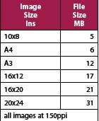
Firstly, you need to know what your printing resolution requirements are. Epson engineers recommend at least 180ppi to 'lose the pixels'. As photographers we often let this slide up to 200ppi or even 300ppi 'just in case'. This is wrong! Most experts in Painter move down to 150ppi, especially if they are to reproduce on canvas or a heavily textured art paper. Importantly, this is the required resolution at the printing size. Forget fancy sums for the moment and consult the table below, which tells you the file size you need for different final picture sizes. If you are starting with an image from a camera or scanner, set the file up at this size and resolution before you move to Painter.
One thing to note about the sizes is that they are actually quite small and so you can comfortably blow up an image from a compact camera to quite a large canvas - in practice you could even get a 20x24 from it.


SWPP - Society of Wedding and Portrait Photographers
The Society of Photographers
Clwyd Chambers, Clwyd Street, Rhyl, Denbighshire, LL18 3LA, UK
Tel 00 44 (0) 1745 356935
Home Page - Find a Photographer - Benefits of Membership - Events and Seminars - Who's who - Photographic Trade Directory - About - Qualification Structure - Mentor Me Programme - Professional Imagemaker Magazine Articles - FREE information pack - Privacy