


articles/Review/presidentpage2002-page1
by Terry Hansen Published 01/08/2002

Acouple of months ago I gave a lecture at Head Office on qualifications, finishing the evening with a critique of prints brought in by members. At the start of the lecture I discussed the common faults I have been seeing in photographs for over 20 years as Chairman of Qualifications for the MPA and now for the SWPP/BPPA. By and large I am seeing the same faults now that I have been seeing for those 20 years. This is despite the advances in technology and the availability of more tuition, either from books, lectures, the Internet etc.
Generally, the faults fall into the following categories:
Focus, composition, lighting, posing, expression, print quality, poses too basic, exposure, presentation, dust mark etc, wrong focal length selection, poor choice of background. The list goes on, but we can now add some new ones that are digitally induced. With the novelty not yet having worn off, we see pictures being over manipulated to the point that they are ruined.
So how do we raise the quality of our work? Well the first approach has to be to compare our work with others. Go and compare the work produced by other studios. Look at the competition entries in the Society magazine. For a personal critique of your work, either send samples to Head Office or attend seminars and ask for advice. Take advantage of the books available from the Society. Above all, be realistic when comparing your work with others.
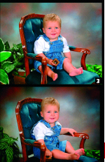
One area that causes most problems is studio portraiture. Here we have to create pictures that will please our customers from scratch. I have taken some shots, which illustrate some of the common mistakes. Picture 1 is typical. A dark background, a reproduction chair and an unflattering pose. Many portraits I see are shot on too short a focal length lens, which in this pose, enlarges the feet out of proportion to the head. The picture is correctly lit from the front but there is insufficient gap between the background and the subject. This puts the background too much into focus and there is no space to put a back light to illuminate the background. The hair is also too dark because we really need a hair light. Picture 2 shows the typical key ring shot. Mum wants a smile so out comes the key ring to be jingled above the camera to get a smile. We now have the unflattering, up the nose, angle.
Gaining pleasing expressions is the job of the photographer, not the parents.
They have no idea where the subject should be looking in relation to the camera and the lighting. Try to have appropriate props for a child of this age.


SWPP - Society of Wedding and Portrait Photographers
The Society of Photographers
Clwyd Chambers, Clwyd Street, Rhyl, Denbighshire, LL18 3LA, UK
Tel 00 44 (0) 1745 356935
Home Page - Find a Photographer - Benefits of Membership - Events and Seminars - Who's who - Photographic Trade Directory - About - Qualification Structure - Mentor Me Programme - Professional Imagemaker Magazine Articles - FREE information pack - Privacy