


articles/Lighting/puttingthedevilintoyourshadows-page1
by Dave Montizambert Published 01/08/2008
by Dave Montizambert
When lighting a subject for digital, should one brighten the shadows more than required and then darken those shadows during processing to ensure that the best shadow information is captured? Or, should one be more sure of themselves and light the shadows to the exact level before taking the exposure? The former certainly gives you more flexibility to change your mind after the fact, but does darkening the shadows during RAW image processing or after the fact using Curves or Levels in Photoshop yield the same results as placing the shadow brightness with lighting? Well let's check it out on the image series of Terrance Toogood (aka Rich Reynolds - fellow photographer, silversmith, actor, fellow yogi, my pilates' instructor, best friend, my batman, oh and did I mention, free model with signed release?).
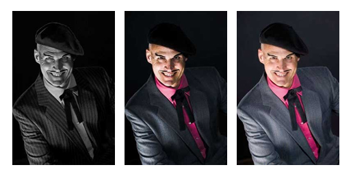
For this theatrical portrait 'devil lighting' was employed, see Image 01. Devil lighting is achieved by lighting the subject from underneath to create up-cast shadows. To further help portray Terrance Toogood as the villain he truly is, I made these up-cast evil shadows in the finished image quite dark relative to his fully lit skin tone. But how evil (dark) should those shadows be? This dilemma worried me; what if I had second thoughts about how dark the shadows were after the set was struck? Could I brighten those shadows during processing or in Photoshop without too much banding and noise appearing in all of the dark tones of the image (if you wish to geek-out further on the banding/noise issue please see the side bar entitled 'Dynamic Range vs Bit Depth')? Ironically I found the answer to this evil dilemma in a quote outside a local church on its marquee - 'Worry is the darkroom that negatives are developed in' - and so it seemed prudent to limit my worries for a happier healthier life by shooting two versions of the portrait: one with low shadow contrast (lighter shadows) and one with high shadow contrast (darker shadows).
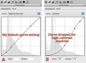
Image 02 shows Terrance with low shadow contrast (fill light's power turned up causing lighter shadows). Image 03 was created from Image 02; this variation uses different RAW processing settings that dramatically increase shadow contrast creating darker shadows. Image 04 shows Terrance with high shadow contrast (fill light's power turned down causing darker shadows). Both Image 02 and Image 04 were processed with my default settings in Adobe Camera RAW, this included the default tone curve setting seen in Image 05 screenshot A. Image 03 used more extreme tone curve settings as seen in Image 05 screenshot B. Comparing Image 03 with Image 04, it is evident that attaining high shadow contrast after the image is captured yields some challenges in dark areas that are not necessarily shadows, ie parts of Terrance's dark hat, tie and brown eyes lose detail. Whereas dropping shadow densities through lighting prior to capture allows us to drop shadow densities without any effect on fully lit dark toned areas. So in the end, which is the best way to go? If time is of the essence and you know exactly what you want and know that you won't change your mind afterwards, then place shadow density where you want it with lighting. If you have time and/or are unsure or know that your client suffers from 'Changing the Mind Disease', then over light the shadows and fine-tune shadow density during processing or in Photoshop with Curves or Levels. Keep in mind that the trade-off to the latter is you will probably have to do some Photoshop work to bring back detail lost in the dark tones. This is exactly what I did with Image 01 which was shot with the same low shadow contrast lighting as in Image 02 and then some really heavy contrast boosting in Photoshop followed by layer masks to hide some of the darkening effects from eyes, hat, etc
The final touch for this image of Terrance Toogood was to convert it to B&W using a B&W adjustment layer in Photoshop. See Image 01. This B&W image with its up-cast shadows and high shadow contrast reminds one of the villains in the early silent films. I should add that as evil as Terrance Toogood is, he was a pleasure to photograph; all he asked for in exchange for posing for me was that I print his email contact info (terrancetoogood@shaw.ca) in this article for any heroine who would like to be tied to a railway track.
Creating appropriate lighting to portray Terrance Toogood as the dastardly villain he is, I enlisted lots of rich shadows. The best way to create lots of shadow form over a subject is to move your lights away from the camera axis, hint: oncamera flash makes for the worst main-light position since it is almost directly on axis with the camera lens. To really get great shadow form on a face, place the main-light to the side, or directly overtop, or underneath the subject. All four of these light positions will skim light across the subject, thus projecting lots of dramatic shadows, visually bringing out the 'character' in a subject.
Now Terrance Toogood is an honest down-to-earth tie-yourheroine-to-a-railway-track sort of character, and so the question of how to best portray his evil attributes didn't take long to figure out; he absolutely needed to be lit from below as though lit from the fires of hell. Not wanting to open up my studio floor to the fires of hell I placed a 3'x4' soft-box on the floor below and to the camera-left side of Terrance, see Image 06 lighting diagram A. The power of this light was adjusted until an incident meter, (pointed dome-directly at this light and held near Terrance's eyes), read exactly the same as the camera's f5.6 @ 1/60th setting.
My choice of background was very dark indeed (somewhere near black in the final image), making it necessary to add separation lights to add backlighting on Terrance to prevent his shoulders from blending into the background too much. There were two lights placed behind Terrance for this purpose, one to his right and one to his left. The separation light on the camera left side to the frame (see Image 06 lighting diagram A) was covered with a frosted acetate gel to even out its hotspots. The power of this light was adjusted until an incident meter, with its dome pointed directly at this light and with its back against Terrance, read one stop darker (f4.0 @ 1/60th) than the camera's f5.6 @ 1/60th setting. To see the effect of this separation light and main-light on Terrance, see Image 07 A.
The second separation light, on the camera-right side of frame, was fitted with a 3'x4' soft-box, see Image 06 lighting diagram B. You are probably wondering why I had one separation light bare and the second separation light fitted with a soft-box? My reason was to ensure that if the second separation light cast any shadows, that these shadows should draw as little attention as possible. To make a shadow less noticeable all you need to do is make its edges softer; softer edges draw less attention than harder edges. Larger light sources see further into shadows, thus eating away at shadow edges rendering them softer. As it turned out, these shadows did not appear with the final poses used, but I felt it was better to be safe than sorry. The positioning of the first separation light relative to Terrance's pose was in no danger of casting unwanted shadows on his neck and so I felt no need to fit it with a soft-box. Using the same metering method as on the first separation light, the second separation light was set to give an incident meter reading of two stops (f2.8 @ 1/60th) below the camera setting. To see the effect of this separation light on Terrance, see Image 07 B.


SWPP - Society of Wedding and Portrait Photographers
The Society of Photographers
Clwyd Chambers, Clwyd Street, Rhyl, Denbighshire, LL18 3LA, UK
Tel 00 44 (0) 1745 356935
Home Page - Find a Photographer - Benefits of Membership - Events and Seminars - Who's who - Photographic Trade Directory - About - Qualification Structure - Mentor Me Programme - Professional Imagemaker Magazine Articles - FREE information pack - Privacy