articles/Composition/rulethirds-page2
Rule of Thirds - part 2 of 1 2
Published 01/06/2005

The white image should have a grid dividing it equally into thirds by the solid colour and then finer lines dividing it further. [3]. These grid lines are not part of the image, just an overlay guide.
Double click on the magnifying tool to enlarge image to 100%. Change the foreground colour to white.
In the toolbox select the line tool, [4] or just press the U key. In the options bar at the top, set your line width to 5px. The other settings should be: the first box on the left (create new shape layer) should be highlighted, the diagonal line should be highlighted, the layer style should be no style, mode normal and opacity 100%.
Starting at the top of each grid line, position your cursor so the cross hairs line up with the grid line. Holding the shift key down, click and drag the cursor down to the bottom of the image. Photoshop will scroll down when you come to the bottom of the window. At the end of the grid release the mouse button, then the shift key. The shift key keeps the line being drawn to a vertical or horizontal line, no matter where the mouse strays as you draw. Repeat this for all four lines.
Now we need a frame around the template. Select all, command/crtl + A. Set the foreground colour to black. Go to Edit>Stroke. In the stroke dialogue box enter Width: 5px, Location: center, Blending: normal and Opacity:100%. [5]. Flatten your image. Layers>Flatten Image. The Rule of Thirds template is done. [6]
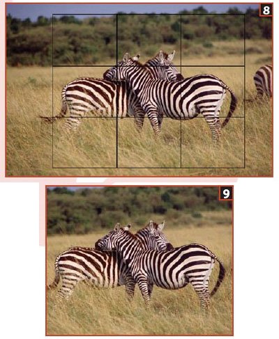
Open your image. Mine is horizontal but we don't have to recreate the template. Make the template image active. To make this template horizontal, go to Image>Rotate Canvas>90 Degrees. Change to the move tool, (V), click drag the template over to your image. [7]. In the Layers Palette, change the blending mode (palette option just below the word layer in the layers palette) to Multiply. This makes the two layers interact in a way that the white vanishes. [8].

Go to Edit>Transform>Scale. Place the cursor inside the template, hold the mouse key down and position the template so the intersecting lines are over an impact point. In this Zebra image I have chosen the foreground zebra face. Move the cursor to one of the corners until you see a diagonal line with arrows on each end. Hold the shift key down, then click and drag to size the template. The shift key keeps the aspect ratio of the selection intact as it sizes. You will probably have to alternate between moving the selection and sizing it until you have what you want. Once you do, double click inside the selection. Switch to the image layer
Select the Crop Tool, C. In the options bar at the top, enter a width of 20in, a height of 16in (reverse if vertical) and a resolution for the printer, in our case 150. Place the Crop Tool at the top corner of the template; drag it down to the bottom corner. Double click inside to crop. Drag the template into the trashcan and save. [9].
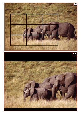
If you want to have an odd-shaped image but still use the golden rule, no problem. Bring up the Transform>Scale. Don't hold the shift key down. As you change the shape of the template, it keeps the division of thirds in place. [10]. Apply your crop as before.
But you still want a 16x20 for competition? Go to Image>Canvas Size. Enter height and width to 16in by 20in. In the layers palette create a new layer, fill with the colour you want; Edit>Fill. To get a colour other than black or white, double click on the foreground colour in the toolbox and choose your colour before you Edit>Fill. Drag the new layer below your image layer, you may have to remove the layer lock first, hold the alt + command/crtl keys down and double click on the locked layer.
In the image layer use the Magic Wand to select the band of pixels created by the larger canvas and press the delete key to remove. You can now see through to the next layer. If you don't want a colour but a texture or image below just add, or alter, to suit.
To position the image on the canvas use the Move Tool, dragging the image into place. When finished, flatten the image. [11].
As a composition tool, the rule of thirds, in its simplest form, can transform an image. Frank Kristian did PPoC's (Professional Photographers of Canada) first fellowship paper on it. It is a detailed exploration on deep into the use of this approach. I really recommend getting a copy from PPoC and learning it. You can further improve this template by using the continual divisions of thirds described in the book, just extend the approach. An additional guide to the template is to define the impact point better. At the start I had you set the grids to a subdivision of two. If you turn the grids back on in the template you will see that around the centre of each intersection is a perfect square. By marking this area out you will have a guide to the impact point area to work in as well.
Please Note:
There is more than one page for this Article.
You are currently on page 2
1st Published 01/06/2005
last update 09/12/2022 14:58:39
More Composition Articles


