articles/Paper/titaniumlustre-page1
Paper Chase PermaJet Titanium Lustre - part 1 of 1 2 3
by Mike McNamee Published 01/06/2013

This paper had a somewhat sensational launch at Focus on Imaging when PermaJet sold all their stock on the first day and indeed have only just caught up with the backlog!
It is a silver metallic lustre finish which is impossible to show on a magazine page but is extremely attractive, most especially on the right kind of image. This immediately poses the question, 'Which is the right kind of image?' A number of choices spring to mind. Anything with metal or glass such as cars, jewellery or glassware are good starting points. HDR images which have been post processed for that typical HDR, highcontrast, low-saturation slightly metallic look (think Richie Walton!!) will undoubtedly be enhanced. 'Fantasy' shots of sport such as those used by Nike and Heineken will come up a treat. Modern fashion will come up well. Does this leave any room for traditional imagery? Monochrome would benefit from the added sparkle but if we go back to where it all started, it was the wedding album people who pioneered the use of silver halide metallic finishes in their wedding albums and so this is an obvious area for exploration - we are probably talking 20- to 35-yearolds here, not your parents on their second time around the block!

In summary then the paper has lots of uses but pushes towards the modern and shiny!
On test
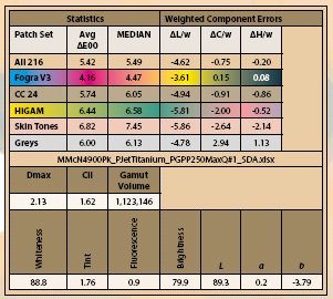
The paper has a slightly cool measured-white-point but in most light and certainly from a slightly oblique angle it looks creamy. There are no OBAs, the media is quite dead in the UV booth and the fluoresce is extremely low. The parameters for Whiteness, Brightness and the Lab Luminance are all low in value but give a false witness to the way the printed image looks, which is quite sparky! The colour audit statistics are therefore a bit worse than the print in hand would suggest.
When we tested the generically similar Tecco Iridium Silver paper (which is NOT the same beast, but an obvious cousin) we said we would return to sorting out the statistics, so buckle up and hang on!
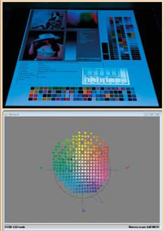
The Lab luminance of the base paper is only 90%. Many of the colours in the test patches have aim points of up to 95% luminance. The printer now has the dual task of making colour (by laying ink down - thus darkening the print) but cannot even start to improve on the low luminance. So despite the fact that the gamut of Titanium is the second highest that we have ever measured, the HiGAM colours show reduced saturation and deeper tone values as the profile struggles to optimise both colour and tone level.
This is most accurately shown by the graph of overall error versus lightness error component for just the HiGAM colours; it is an almost perfect straight line which means that the lightness the almost exclusively the bad actor in all this. Aside from the error in lightness the colours are rather accurate.
You are currently on page 1
- Paper Chase PermaJet Titanium Lustre page 1
- Paper Chase PermaJet Titanium Lustre page 2
- Paper Chase PermaJet Titanium Lustre page 3
1st Published 01/06/2013
last update 09/12/2022 14:59:55
More Paper Articles


