


articles/Paper/artexpression-page2
by Mike McNamee Published 01/06/2007
The choice of 'media setting' caused us some problems. Some of the printer profile sets on the Hahnemuhle website include instructions for media setting - the 3800 set does not. The 4800 instructions suggest Velvet Fine Art or Water Color Radiant White (VFA and WCRW). Normally this media setting does not have much influence on the grey neutrality, only affecting the inking level, black density and the tone scale. However, after producing a succession of audit prints that were biased yellow, we re-ran a number of tests and discovered that WCRW was creating a problem compared with VFA. We thus switched to using VFA and started all over again. Painful though this was (we were a day into the testing by this time) the moral is obvious, you should scope the choices before you start any substantial testing! Avoiding WCRWHahnemuhle profiles settings might be a good starting point.
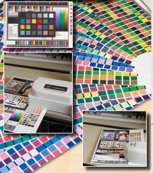
Having obtained half-decent prints we began the auditing process. The colour statistics were gathered using an X-Rite DTP 41 set up for D50/2°, the conditions which were used to build the profiles. Examining the Hahnemuhle profile tags showed them to be built using X-Rite Eye 1 using a 918-patch target and compensated for fluorescence - all good practice! Metamerism was assessed using an X-Rite Digital Swatchbook spectrophotometer and testing the nearest neutral grey to 50% density between D65 Light and Tungsten Light Illuminant A. Dmax was measured on both the DTP 41 (at D50) and the Swatchbook (at D65). Gamut Volume was measured using the Gjǿvik University College methodology, using the Hahnemuhle profiles.
The surface texture of the media is a critical property for the user. Given that all the papers perform well, it is this personal preference which will drive the choice after decisions have been made in regard to weight, OBA-use, etc. To assist in this we photographed a portion of the audit target in glancing north daylight and used a miniature Macbeth Chart to calibrate the actual shot and assign a profile ahead of conversion to CMYK for printing. The CMYK versions were in all instances slightly duller than the original - process printing does not have the gamut of Epson K3 ink!
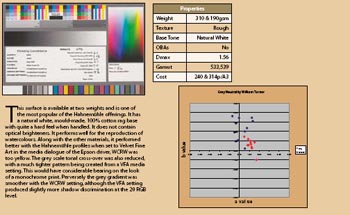
William Turner 190 and 310 ArtLine
This surface is available at two weights and is one of the most popular of the Hahnemuhle offerings. It has a natural white, mould-made, 100% cotton rag base with quite a hard feel when handled. It does not contain optical brighteners. It performs well for the reproduction of watercolours. Along with the other materials, it performed better with the Hahnemuhle profiles when set to Velvet Fine Art in the media dialogue of the Epson driver, WCRW was too yellow. The grey scale tonal cross-over was also reduced, with a much tighter pattern being created from a VFA media setting. This would have considerable bearing on the look of a monochrome print. Perversely the grey gradient was smoother with the WCRW setting, although the VFA setting produced slightly more shadow discrimination at the 20 RGB level.


SWPP - Society of Wedding and Portrait Photographers
The Society of Photographers
Clwyd Chambers, Clwyd Street, Rhyl, Denbighshire, LL18 3LA, UK
Tel 00 44 (0) 1745 356935
Home Page - Find a Photographer - Benefits of Membership - Events and Seminars - Who's who - Photographic Trade Directory - About - Qualification Structure - Mentor Me Programme - Professional Imagemaker Magazine Articles - FREE information pack - Privacy