articles/Paper/canvasoptions-page7
Paper Chase - Canvas options - part 7 of 1 2 3 4 5 6 7
by Mike McNamee Published 01/08/2004

The data were split into 4 categories for analysis, the Macbeth Colours, the greys, the skin tones and the landscape colours. Both Lab Delta E and Delta E 2000 are quoted. The results track our general findings, namely that skin tones come out most accurate and the landscape set the least accurate. This is a feature of the colour sets rather than an inherent capability of the printer/0 paper combination. In common with every data set we have for the Epson Ultrachrome ink set, the least accurate colour is the spectral blue which is right on the margins of the gamut. This is a bit of a statistical thing as the blues usually look OK in a print. We were beginning to think it was something about the profiling software until we did a Fuji Pictography recently and this was much better in the blues (it is an RGB device after all!).
DCP Canvas
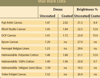
This is a brand new material made for wide format specialists DCP, whose varnish is featured in this test. This media is out on its own in terms of white brightness and coolness being heavily optically brightened. The Oxford weave has a softer, larger weft, which, in combination with the slight glaze to the coating, creates a directional pattern for a realistic painter's canvas effect. The gamut volume was the lowest of the group although the colour quality of the prints looked OK. Overall this is a canvas most suited to reproducing modern styles (paintings or portraits) where the extra zip of the brighteners would be welcome. It would be a poorer choice if you were chasing an "Old Master" feel to your low key portraiture, although there is an argument that the slight yellowing produced by varnishing could counteract the blueness.
Epson Canvas
Other than the Permajet Belgian Linen and the Folajet canvas, this is one of the more creamy finishes. It also has a slight glaze to it which accentuates the painterly look as the canvas is moved about in the light. There were occasional dropped stitches in the weave which added to the charm of the media. One comment worth making about canvas such as this one, with more character to their weave is that fine detail is disrupted sometimes with unfortunate effect. In our Audit Image one of the model's eyes were just in the wrong place giving them a slightly spooky look. The moral is obvious, make sure that your image scale and look is not dependant on reproduction of fine detail. It is arguable whether a large portrait group would better avoided onto a media such as this. The Epson media is not water resistant, indeed the image disintegrated when varnished with the DCP water based varnish. However, the slight glaze reduces the need to varnish to achieve an oil painting look and there is also the option of framing behind glass.
Permajet Belgian Linen
This and the Folajet are the most "Old Masterly" of the medias in this test.The coating is a rich cream tone set onto a fine warp combined with a quite large soft weft. This produces a characteristic diamond pattern to the surface which transforms to a horizontal structure at other angles. The coating is slightly glazed and the ink takes a little longer to dry than the other media. It is not water resistant and the image disintegrated when DCP varnish was applied. This material had the weakest Dmax but not the smallest gamut volume. It had one of the better landscape colour accuracies but was the poorest on skin tone accuracy. The skin tones were very good on saturation accuracy but rotated towards yellow in the hue parameter.
Please Note:
There is more than one page for this Article.
You are currently on page 7
- Paper Chase - Canvas options page 1
- Paper Chase - Canvas options page 2
- Paper Chase - Canvas options page 3
- Paper Chase - Canvas options page 4
- Paper Chase - Canvas options page 5
- Paper Chase - Canvas options page 6
- Paper Chase - Canvas options page 7
1st Published 01/08/2004
last update 09/12/2022 14:52:14
More Paper Articles


