articles/Printers/epsongamutboost-page2
Epson Gamut Boost - part 2 of 1 2 3 4
by Mike McNamee Published 01/10/2008

The practical benefits of the larger gamut are as listed below:
1. A larger range of Pantone Spot colours will be brought into gamut for accurate reproduction in proofing.
2. More out-of-gamut (oog) colours in fine art reproduction will be pulled into gamut giving better discrimination of subtle watercolour tones and the ability to actually reproduce some more of the very saturated, acrylic media.
3. The flexographic users will be delighted. Traditionally they have had to utilise many spot colours and dodges in their massive print runs. They will now be able to accurately proof their concoctions. The people who make the packaging mock-ups for focus groups can also get closer to the accurate colours they will eventually print using spot colours. The classic example is Cadbury purple on their drinking chocolate, a fiendishly difficult colour to get right without a spot colour.
4. A larger colour range means smoother gradations between colours. The expanded range should open the possibility of smoother skin tones (and many other colours for that matter).
The Data
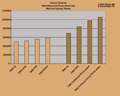
The gamut volumes are shown in the histogram and the 7900 is compared with the 3800. The data on the 3800 are a compilation of more than 50 surfaces and ink combinations. On the left are the results for Matte Black ink sets onto matt and art surfaces. On the right (dark brown) are the results for Photo Black inks onto luster, gloss and baryta surfaces. In each case data from Epson ink and third-part CIS inks are shown. The gamut volume of the 7900 is always best-in-class. On a more practical (and visual) level we used the soft proofing of Photoshop along with its gamut warning flag to examine the profiles against real images and paint pigments.
Pigments
The paint pigments were prepared by Lukman Sinclair. Lukman had experienced some difficulty in reproducing the popular pigment 'cadmium red'. Differentiating between subtle changes of tones with these reds had been a particular problem with differences in originals not being reflected by differences in the prints made from scans. The colours chosen were Windsor and Newton's, Cadmium Orange, Cadmium Red, Alizarin Crimson, and a final swatch that was a mixture of the last two.
The Cadmium Orange is almost completely outside the sRGB gamut (people who photograph paintings take note!). A couple of areas are out of gamut on the 3800 but all are in gamut for the 7900. This test was for Watercolour Radiant White media, using matt ink. This pigment set were not fully in gamut for the Adobe RGB colour space.
Please Note:
There is more than one page for this Article.
You are currently on page 2 Contact Mike McNamee
1st Published 01/10/2008
last update 09/12/2022 14:53:55
More Printers Articles


