


articles/Paper/halfterm-page1
by Mike McNamee Published 01/11/2004
Paper Chase has now been running for 6 issues and we have not yet even left art papers behind us! Encouraged by your support we are carrying on but it instructive to take a little time out to consider what we have learned so far.
The paper suppliers are a bit like mushrooms. We no sooner pick them off than another one pops up and from afar they like quite alike! Even though we have a backlog of paper and data to give to you, at Photokina this year there were new ranges and new papers from Croppers, Innova, Permajet, Olmec, Hahnemuhle, Epson, Ferrania, Kodak, Calumet and Felix Shoeller - and they are only the ones we saw! We have not even started on the gloss, lustre and semi matte ranges although we have started some analysis.
Paper Chase
the midterm report What have we learned from our chasing the paper trail? Well paper is a complex substance made even more so by the addition of an ink receptive layer followed by a ladling of inks. It is the subtle differences between the ways the various inks diffuse into the coatings which is the source of all our woes! This is what causes the tonal scales to wander about in a seemingly random fashion. Having made and tested 498 paper/ink/printer combinations so far in Paper Chase (a total of 11 million data points) we are starting to build a picture of how printers vary between each other and between models.
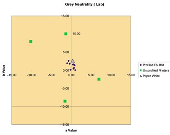
In a nutshell we find that the Epson 7600 and 4000 models are less variable than the Epson 2100 which is less variable than the Epson 1290.We have also tested a variety of other printers and some continuous ink flow systems. In only one instance during our 500 tests did we find that bespoke profiling a printer ink combination failed to improve the colour accuracy of the output. The worst performing printers were truly ghastly with absolutely no hope of producing a commercially acceptable print from them. Another thing we have come to note is the difference between peoples' perception of print quality. We have had photographers expressing mild dissatisfaction over awful prints and at the other end of the scale photographers tearing out their hair over prints which cannot be realistically improved upon - this is one reason why we wrote and developed our ColourAudit routine and data analysis. It is a risky business to reproduce the effects of poor print quality in a magazine but our composite image shows two of the worst offenders either side of a pure digital file. We have chosen not to reveal the source of the print as some of the heritage of the systems was not fully understood and mistakes do happen. Not all of our bad actors were inkjet printers, we have also examined a number of other technologies. There are a number of ways of expressing colour error, but for simplicity we have plotted the error in the neutral greys from some of the poor printers and compare that data with a set from a profiled inkjet.
What does the graph teach us? Well the problem is sometimes but not always the operator, there are occasional machines, which behave badly. One advantage of the Epson 9600, 7600, 4000 series is that they are the so-called "D2" range, made to higher tolerances - and it shows! Other than that, operator based errors have involved printing on the wrong side of the paper, using machines without doing a nozzle check (us included - we build one profile without using cyan at all!) and simply setting up either the profile build parameters incorrectly or the printer settings incorrectly. As we said last issue, setting up to do certain print jobs can involve up to 28 mouse clicks. Experience with RIPs has been mixed, they have produced some good and some poor results.Paper chase
The quality of profiles out there is rather mixed. The manufacturers have got to realise that the use of their product will stand and fall on the initial results the user obtains. If the manufacturer puts a poor profile on their web site and it subsequently produces a poor print, the chances of repeat orders are slight. Make no mistake there are some scabby profiles out there - you can check for yourself on how they have been made by opening an icc file in "Notepad" and looking through the raw code of the file. This tells you how many swatches have been used in the generation of the profile (more the better) and which software and spectro was used. The final arbiter is always the print though. The more progressive suppliers have got wise to the problem and in some instances it is the enthusiast and specialist user groups who have led the way. The result is that most of the major manufacturers now have good quality profiles on their web sites. This will not assist those who have machines which behave some way from the norm (like the ones in the graph) - if you are the unfortunate owner of one of these, your only option is to have a bespoke profile made.
Metamerism
Just when we thought we were getting a real handle on metamerism, the water has got a little muddier. It started when we tested a sample print of Epson Premium Semi Gloss and noticed by chance that it was abnormally metameric in low energy bulb light, in fact it had turned quite pink, visually. If you wish to gauge what we are relating, it was close to a Pantone 437c, (that is Lab co-ordinates of 50; 10; 0 (RGB 125,109, 115)).You can go to the Photoshop Color Picker and look at the colour itself. This came as a bit of a shock as the Epson Ultrachrome ink set has normally been quite low on metamerism. The index of metamerism was around 4.0 to 4.7 Delta E depending upon how it was measured. This is more than twice the normal value for an Ultrachrome ink set on a neutral 50% grey. What we are finding perplexing (and infuriating) is that the maths does not properly support our visual observations; however, the effect is high enough to eliminate Premium Semi Gloss as a contender for monochrome use particularly if you wish to match grey tones in an album. This is a topic which will bear some more investigation in the second half of the term! We had three samples to compare which were perfectly matched in a D65 viewing booth but markedly different in low energy bulb light and less different in tungsten light and a normal fluorescent (domestic) light. It is not that they were different which surprised us it was the level of difference. We gained a slight clue from the spectral output trace of the bulb, which was a riot of spikes, criss-crossing the graph. Perhaps the moral of the story is to avoid low energy bulbs in you studio but even with this precaution you may have no control over the light which your client views their print in.


SWPP - Society of Wedding and Portrait Photographers
The Society of Photographers
Clwyd Chambers, Clwyd Street, Rhyl, Denbighshire, LL18 3LA, UK
Tel 00 44 (0) 1745 356935
Home Page - Find a Photographer - Benefits of Membership - Events and Seminars - Who's who - Photographic Trade Directory - About - Qualification Structure - Mentor Me Programme - Professional Imagemaker Magazine Articles - FREE information pack - Privacy