


articles/Paper/halfterm-page2
by Mike McNamee Published 01/11/2004
Two Glossies
Just to get the ball rolling on the glossy and lustre papers we have pulled out two of the papers to give you a taster.T hey are the Kodak professional Gloss and the Calumet Brilliant Gloss.
Kodak Professional Gloss
Launched at Photokina, this is a medium gloss paper weighing in at 255gsm and 23 microns thick, about the same as an en print material (maybe a little thinner). The back of the paper is embellished with the logo "Kodak Professional Paper". The base white of the media is a cool blue and it does contain optical brightening agents; there is a lift of about 3% at the blue end of the spectrum due to the fluorescence.
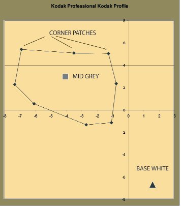
Bearing in mind our remarks at the head of this edition of Paper Chase we were anxious to test the profile provided on the Kodak web site.The one we used was named KproIPaper_EpSP2100_v1.icm.This is quite a large profile built from 514 swatches, presumably using Kodak's own colour management profiling system. The gamut volume of the profile was 816,000 putting it in the upper bracket and a little below the HiFi ink system of the R800 reviewed elsewhere in this issue. We tested on our Epson 2100 using Premium Semi Gloss photo paper as our media setting, 2880dpi as our printer resolution, High Speed was set to OFF BPC was On and we used a perceptual rendering intent.
The Colour Performance
Whole Gamut
The print was quite pleasing with an overall error in colour of 3.9 (DE2000) points compared to an average for bespoke profiled 7600 machines of around 3.3 on the same scale. Measured on the more common Lab error this averaged at 5.5 delta E which should be assessed against a contract proof standard of between 4 and 7. So, for an off-the shelf profile this was a good result, one of the best we have tested. There was an overall drift towards green of about 5 Lab points on the a and b scales. This was most noticeable in the greys, the most sensitive part of the perception of the human observer. The overall error in the lightness channel was to make the print between 2 and 3% too dark.
Paper ChaseFlesh Tones
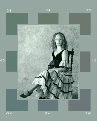
The all important flesh tones had an overall error of 2.84. The errors in the Lightness, Hue and Saturation channels broke out to 2.1; 2.9; and 0.36 - hence the error in the hue was low. The graph shows the plotted skin tones and the resulting print values. The saturation is maintained for most of the sweep of flesh tones and the hue just starts to push into the more yellow part of the quadrant for the paler skin tones.
Photokina the paper round up


SWPP - Society of Wedding and Portrait Photographers
The Society of Photographers
Clwyd Chambers, Clwyd Street, Rhyl, Denbighshire, LL18 3LA, UK
Tel 00 44 (0) 1745 356935
Home Page - Find a Photographer - Benefits of Membership - Events and Seminars - Who's who - Photographic Trade Directory - About - Qualification Structure - Mentor Me Programme - Professional Imagemaker Magazine Articles - FREE information pack - Privacy