articles/Cameras/kodakdcs-page4
KODAK DCSPro14n Big Chips for High Rollers - part 4 of 1 2 3 4 5
by Mike McNamee Published 01/04/2005

Colour Precision
This is the section where Martin Sellars came into his own, especially as we were working with a trustworthy, calibrated monitor. The DCS 14n carries an impressive array of colour controls especially when allied with Kodak DCS PhotoDesk.
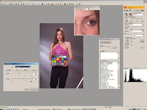
Adjustment by eye, off the screen is easy providing the operator has a good eye for colour. The use of RAW files allows the imposition of a selected White Balance and exposure compensations after shooting. Indeed you may process and re-process the RAW file with as many variants as you choose. White Balance may be set with a click on an appropriate part of the image (in our case a Macbeth Chart) or by relying on the visually accurate screen view. One down side of using the screen view is that re-rendering the image took about 20 seconds each time, which got to be irritating.
For those obsessed with numbers (including your reviewer) they are reported at the base of the window of Photo Desk.
Productivity of the system is quite good. You may select all the RAW files in a folder, correct the image containing a reference grey scale and all the images are corrected simultaneously.
Processing a large batch of images can take a while, about a minute per image on an average specification computer.
We processed our images by setting the grey scale to neutral using the "Click White Balance" the adjusting the Exposure Slider to give 121R 121G 121B on the mid grey (the required value for a gamma of 2.2). The exposure adjustment has an extended range in that capture is over 12-stops but the file is delivered with an 8-stop range. This allows recovery of 2 stops of real data from an over exposed (or under exposed) RAW file.
We then set the "look" Profile before back-calculating the colour precision across the whole gamut of the Macbeth Chart.
Using this method the average error across the Macbeth Chart was 7.0 Delta E. In layman's terms our findings can be described as follows:
1. The overall error rates as very good. In fact the variations shot to shot due to lighting fluctuations were of the same order as the average error.
2. Overall the errors were highest in the hue lowest in the saturation component although they were quite evenly split between the hue saturation and lightness components.
3. The least accurate colours were the deep blue and deep red.
4. The most accurate colours were the sky blue and foliage green.
5. The Dark and Light Skin tone accuracies were around the average value of the group with the errors being split between all three components. The residual errors all pushed the colours towards more saturated and more yellow, just the sense you would prefer if errors were inevitable.
6. The average error was slightly higher than that of the Nikon D100. Nikon always claim that they aim for accuracy leaving the photographer to adjust their colours to taste. To some extent Kodak have done the job for the photographer.
7. Overall the colour from the studio tests were very good indeed. Any residual errors would probably be masked by errors in the printer profile. Only the best, profiled printers can achieve the level of accuracy shown by the DCS 14n.

Looks
Kodak provide different "Looks" within PhotoDesk. By default, eight are installed; many others are available from a separate CD. We looked in detail at "Product", "Portrait", "Reduced Portrait", and "Wedding". The details of our testing are found in the call-out box.
In summary , the Looks generally enhanced the images in the direction which most observers would prefer even when moving the actual accuracy away from the target value. Un the cover image of our model Claire we used White Balance setting to neutralise the grey scale, adjusted to the correct exposure value of 121RGB, set Portrait Look and converted to CMYK for printing. The only other thing we did was apply some sharpening and some noise reduction. The image was shot on a 105mm Micro Nikkor under studio flash at F5.6 using Type 1 Lens Calibration. The Backdrop was neutral 50% grey.
Here's Looking at You!
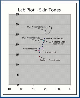
The effects of Kodak Looks are easiest to describe using a graphical representation from the Lab Plot. The Macbeth Light Skin has Lab a/b values of 14/17. Experienced printers (in the Caucasian social sector) usually prefer their skin tones to have values which are more saturated and more yellow (i.e. a more Tanned looked). In the Asian market they are all keen to be shown whiter, indeed many Indian women spend a fortune on skin-whitening treatments. To put a maker on the graph, we measured a couple of prints, which Martin Sellars selected as his "preferred" skin tones for a female model and for a baby shot. As an additional benchmark, the Nikon D100 has the ability to increment the White Balance in 200°K steps from -3(4800°K) to +3 (6000°K) (all for the Flash setting). These data generated the blue line which starts from inside the Macbeth value and gradually moves up and right (i.e. more yellow). Superimposed on this data are the Kodak Looks. Portrait Look is slightly more red and slightly more saturated. Reduced Portrait Look is less saturated. The Wedding Look and Product Look provide an identical more saturated skin tone but apparently the Wedding Look also takes more care of the black end of the scale to ensure that the groom's suit is both neutral and detailed. The latter might just get lost in the printing of the image unless the camera profile and the printer profile are very well matched. The plotted ellipses are Martin Sellars' preferences for a tanned model and a baby, note that he prefers even more saturation than that delivered by the Wedding Look. Rest assured though that we are talking preferences here and individual photographers are at liberty to adjust to their own taste. The beauty of the RAW file is that you can go back and re-render if you do not like your first attempt!
Additional Looks are available for mimicing particular filters and film stocks. For example you can hold your skin tones in their colour position while boosting the higher saturation colour around them. A number of Looks deal with specific mono chrome effects such as Wratten 25 and Wartten 8 mimics.
Please Note:
There is more than one page for this Article.
You are currently on page 4
- KODAK DCSPro14n Big Chips for High
Rollers page 1
- KODAK DCSPro14n Big Chips for High
Rollers page 2
- KODAK DCSPro14n Big Chips for High
Rollers page 3
- KODAK DCSPro14n Big Chips for High
Rollers page 4
- KODAK DCSPro14n Big Chips for High
Rollers page 5
1st Published 01/04/2005
last update 09/12/2022 14:55:34
More Cameras Articles


