


articles/Portraiture/lowkeyportraiture-page1
Published 01/06/2004

What goes around come around! For quite a few years we have seen a preponderance of stylish high key, dreamy images and have indeed published a couple of articles on the subject ourselves. Low key seems to be on the way back at the moment and so it is timely to look at the technique and its methods.
What is Low Key?
Quite simply put, low key is a description of an image, which contains a higher proportion of dark tones than light tones. Take this issue's cover image. If you open the original image in Photoshop and look at the histogram of the luminance channel you see that the average RGB value RGB is just 46 points. Using the colour range to select just the highlights confirms that these light tone occupy just 1% of the pixels. However, what an important 1% they are, containing the entire facial details, the hands and defining the folds of the satin dress!
Old Masters
The painting of the Old Master such as Rembrandt were often made in low key.T here are a number of reasons for this, but one was to overcome the limitations of pigments available at the time. In order to make the face of the subject bright and glowing one dodge is to surround it by darker colours so that they eye is fooled. Perhaps the archetypal examples of this are the painting of the Christ child in the manager, glowing out of the cot as if lit by a snooted Bowens! What the artist are doing here is shaping the passage of the viewer's eye towards the important part of their picture. There is a lesson here for the low-key photographer. You can have you subject's face slightly darker and more saturated if you are going to surround it by a dark background .The eye will then bring up the value - an effect known as simultaneous contrast.
This is one reason why we asked Terry Hansen to look at light meters for this compilation article. Getting controlled lighting is the key to achieving the correct fell to the image. Light meters have got a little left behind in these digital days but for setting up and balancing lights they are indispensable
How dark can you go? Low Key
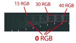
Especially if you are outputting to inkjet, you need to know how dark your tones are going to reproduce. A slight disadvantage of fully colour managed and profiled workflows are that the shadows below 30 RGB points are sometimes blocked up by the profile. If you find the deepest shadow on your image and then click your shadow dropper on this you will force that shadow area all the way down 0 RGB points and possibly take detail away form the surrounding areas. Providing you know just where shadow blocking is gong to occur you can set your default low RGB value higher or tweak your tone curve to accommodate your profile characteristics. We showed you how to correct this I our feature on colour control last year but in a nutshell you lift the darkest tones in which you require detail above the point at which they block out. To find this point you make a graduated grey scale using the gradient tool then posterise it into about 30 steps and print it. Then you look at where you can no longer differentiate the black tones and go back to your computer and measure the RGB values using your dropper and the Info Palette. If you find that that point is 40RGB points then you now know that all values below that will print as featureless black.


SWPP - Society of Wedding and Portrait Photographers
The Society of Photographers
Clwyd Chambers, Clwyd Street, Rhyl, Denbighshire, LL18 3LA, UK
Tel 00 44 (0) 1745 356935
Home Page - Find a Photographer - Benefits of Membership - Events and Seminars - Who's who - Photographic Trade Directory - About - Qualification Structure - Mentor Me Programme - Professional Imagemaker Magazine Articles - FREE information pack - Privacy