


articles/Postproduction/tintingtoning-page1
by Mike McNamee Published 01/04/2006
Duotones, Tritones & Quadtones
The duotone is becoming something of a dinosaur in this age of high-speed, on-demand, colour printing. It remains, in skilled hands, one of the best ways of reproducing monochrome in full and luscious depth. In the pressroom, two plates are prepared - usually a black and another colour (or in the case of tritones, two colours). The black is usually used to create a full tone range from around 5% through to 95% dot. The second, usually lighter, colour is printed at perhaps 15% to 95% dot. Sometimes for improved monochrome reproduction, the second colour is a light grey which adds body and, if slightly coloured, will warm or cool the eventual result.
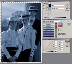
In Photoshop, the image is first converted to Grayscale and then Duotone is chosen to bring up the duotone options box (see screen grab). If you click on the coloured swatch you open (by default) the Pantone series in the colour picker. You may then use the arrow keys to scroll through the colours looking for a result you like. This sets the colour bias of the eventual print. Then if you click on the graph icon it brings up the ink level of the second colour and you can adjust how much contribution your coloured ink makes at any part of the tone range. At Professional Imagemaker we often use the trick of selecting a Pantone colour for the headline type or solid blocks of colour and then use that same Pantone to enliven a monochrome portrait of the featured photographer. It all helps to add colour depth and harmony to the page layout. The same trick can equally be employed when making up album pages
As well as making your own duotones, Adobe provide 137 presets as duo-, tri- and quadtones, plenty enough for most applications. Most readers will be converting back to RGB or CMYK for output, if you are preparing real duotones for print make sure that you take the advice of your printer before you start.
Sepia Toning
It is one of the delicious ironies of photography that half of the world is trying to eliminate tone from their ink-jet prints (ie make neutral prints) and the other half (the traditional set) spends hours dunking their prints in all manner of chemicals to try to inject subtle tones to their monochrome papers.
In traditional photography the main toners are sepia (thioureadicarbamide or sodium sulphide), gold, selenium and occasionally iron and copper. These all aim to substitute metals in the structure of the emulsion. In the case of gold and selenium the emulsion is rendered more chemically inert to pollutants. Iron and copper are less stable than silver. Sepia toners are also more stable in the majority of environments. Selenium and sodium sulphide are toxic; the former can be particularly dangerous through both inhalation and skin absorption, sodium sulphide is caustic in water as well as producing an obnoxious smell, along with hydrogen sulphide (which is toxic at a parts per million level).
It is therefore small wonder that many of us have willingly left the old ways behind - your writer's darkroom sink is currently living in Mrs Editor's potting shed awaiting the first flush of spring seedlings! The difficulty of creating toned prints in the traditional darkroom has not dampened the enthusiasm for the look that they produce and there are a variety of digital manipulations to recreate them.
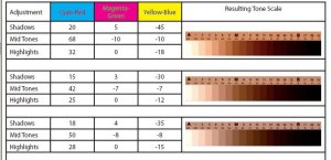
The simplest methods for toning are both provided for in the default actions which come with Photoshop. They use either Colorize or Channel Mixing to effect the change to a (starting) colour image. When you colourize in Photoshop you simply check the Colorize check box and then slide the Hue until you create the tone you are seeking. A setting of 22° gives a peachy sepia, 34° is a traditional sepia tone (possibly with a +15 on Brightness). As soon as you push on towards 40° an ugly green tinge starts to invade the procedings and should be avoided. A hue angle of 220° gives the colour of an iron toner. A hue angle of 254°, combined with a drop in saturation to 11%, recreates a heavy selenium toned print, a rich purple colour.


SWPP - Society of Wedding and Portrait Photographers
The Society of Photographers
Clwyd Chambers, Clwyd Street, Rhyl, Denbighshire, LL18 3LA, UK
Tel 00 44 (0) 1745 356935
Home Page - Find a Photographer - Benefits of Membership - Events and Seminars - Who's who - Photographic Trade Directory - About - Qualification Structure - Mentor Me Programme - Professional Imagemaker Magazine Articles - FREE information pack - Privacy