articles/Cameras/cameracalibration-page1
Camera Calibration - part 1 of 1 2 3 4
by Mike McNamee Published 01/02/2006

In September we wrote on the matter of calibration right through to high-end kit from the likes of GretagMacbeth and X-Rite. A number of issues were inadequately resolved and it was always our intention to revisit the matter.
There seem to be two schools of thought on colour accuracy (for that is what we are talking about) - one school frets and fusses over it, the other takes the view that if the customers are happy and they (the photographers) prefer to tweak their colour anyway then it matters not a jot. I do not propose to take sides on the matter, only to point out some of the issues and pitfalls.
The first issue is this. If you habitually increase your saturation in your portraits (usually for Caucasians), any residual colour bias in the shot will be mercilessly revealed. The second is the problem of allowing your colour balance to drift slowly, so that you only notice after a break or perhaps when a laboratory prints your images or, especially, if you try to colour match a pair of prints.
The previous comments apply mainly to wedding and portraiture where the expression, mood and capture of "the moment" are of paramount importance. If the shot is for a garment catalogue (or similar) then colour accuracy becomes paramount and different rules apply. Blue garments require accurate blues and so on. If the image is going to press output (rather than ink-jet or silver halide) another set of hurdles may have to be jumped before everybody is happy, including accurate colour proofing.
This second part of calibration aims to compare the effect of three correction workflows, all via RAW files. They are:
1. Grey Balancing only via • A grey card • An expodisc 2. Profiling - a repeat of the "September" methods 3. Use of the freeware ACR-Calibrator
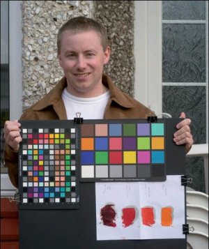
The sting in the tail is that we are to attempt a fiendishly difficult reproduction of some paint pigments, provided by artist, Penny Warden (see call-out box). Penny provided the four pigments, which she routinely uses for her iconic imagery, all in the yellow/red quadrant of the Lab plot. They are subtly different and are very metameric (ie they change colour quite a lot when viewed in different types of light).
The Methods
The RAW image was shot under overcast sky at 1/80th at f8 at 200ISO on a Nikon D100, through a 55mm f2.8 MicroNikkor. The exposure was assessed using a Gossen Mastersix incident light meter of known accuracy, but proved to be so difficult to pin down to our aim of 1/10th of a stop that we ended up bracketing (in 1/3 stops). We shot in very weak overcast daylight, at a (measured) colour temperature a little short of 5000K. The time was 2pm (January) and the direction of the light was quite low and straight at the test images. We used Macbeth 24 swatch and SG targets along with Penny Warden's pigments in the same shot. The D100 was set for "cloudy" white balance but because we were anticipating only RAW files, the slight mismatch was no a problem.
Grey Balancing
We balanced the RAW file in Photoshop CS2 using the mid tone grey of the Macbeth chart (for consistency, you might ordinarily only have a grey card). We reported on the variations possible in part one of this series and they include Macbeth Charts, Kodak Grey Cards, and the Dave Newman collapsible target.
You are currently on page 1
- Camera Calibration page 1
- Camera Calibration page 2
- Camera Calibration page 3
- Camera Calibration page 4
1st Published 01/02/2006
last update 09/12/2022 14:52:06
More Cameras Articles


