articles/Digital/colouradjust7-page4
Colour Adjustment - Part 7 - part 4 of 1 2 3 4 5 6 7
by Mike McNamee Published 01/11/2003

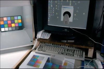
Professional Imagemaker's main design work station and proofing area. Our monitors are calibrated with an X-Rite Screen Optimiser and we use the X-Rite Digital Swatchbook to check both the input and outputs. The viewing booth on the left is equipped with D50, D65, Tungsten and Ultraviolet lighting.
On Screen- Soft proofing
This is a relatively new feature, introduced in Photoshop 6 and onwards. Assuming that the relevant profile is available in the "colour" folder, Photoshop can access it and present, on screen, a quite accurate impression of how an image will print with that profile/ink/paper combination. It is turned on by clicking View>Proof Colors>Custom; then select the profile from the drop down menu. If your CMYK working space is, for example, Euro Press and you wish to soft proof to that standard then clicking Proof Working CMYK or simply Ctrl-Y will produce the result. You may even compare different options for output by clicking Window>Document>New Window. This opens a new view of the current image, which can be soft proofed with a different profile.
Perfect representation of an output is not possible because screens and paper are distinctly different ways of displaying images. It is nevertheless possible to obtain an accurate idea of how an image will behave when it is printed. This assumes that your screen is calibrated and is displaying at the same colour temperature as your viewing area. Prepress standard is D50 (i.e. 5000°K) but other standards use D65 (6500°K). If you do not adjust your monitor, it is quite likely to be running at 9500°K and will be very blue. Until your eyes get used to it, D50 will look quite yellow compared to D65. Of greater importance to viewing is actually the illumination level. Screens are quite dark (think about how poorly a monitor lights a room on its own) and a transparency to be matched should be lit to the same level. On the other hand ISO standards for "proof viewing" call for very high illumination levels (1,500 to 2,500 lux compared to normal office lighting levels of 200 lux). At the same time the standard calls for near darkness when adjusting on-screen images (32 lux). You certainly can't maintain both in the same room as the proofing level will flood light everywhere! Some experts recommend that you do not place a transparency viewer and monitor side by side but force the user to turn away by 90° to make the comparison.

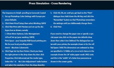
Cross Rendering for CMYK proofing It is quite common for a prepress provider or printer to ask for an RGB image so that they can control the conversion to CMYK to their common standard. In these circumstances it is still imperative that a hard copy goes with the job so that everyone knows what they are looking at. One way is to cross render the image into a proof which takes the RGB data, converts it to a CMYK simulation and then uses the inkjet's RGB based profile to ensure the accuracy of delivery of the CMYK mimic. Photoshop may be set up to do that (see the call out boxes) and even mimics the off-white base-tone of the standardised print stock. When you soft proof or the cross render do not leave white margins on screen or on the paper proof. If you do it will look a dull beast in comparison to its RGB cousin- that is a fact of life, we are making a simulation of the eventual output which is never going to be as bright as an inkjet!
Please Note:
There is more than one page for this Article.
You are currently on page 4
- Colour Adjustment - Part 7 page 1
- Colour Adjustment - Part 7 page 2
- Colour Adjustment - Part 7 page 3
- Colour Adjustment - Part 7 page 4
- Colour Adjustment - Part 7 page 5
- Colour Adjustment - Part 7 page 6
- Colour Adjustment - Part 7 page 7
1st Published 01/11/2003
last update 09/12/2022 14:52:37
More Digital Articles


