articles/Monochrome/themonochromeissue-page1
The Monochrome Issue - The Output Options - part 1 of 1 2 3 4 5 6 7
by Mile McNamee Published 01/04/2006

What's Important?
It is worthwhile recapping on the parameters that are especially important to the monochrome specialist and describing how they are quantified and how they affect the look of an image.
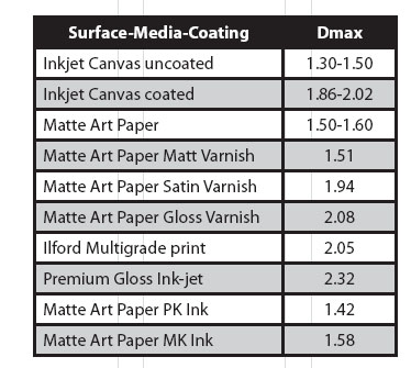
This is the maximum black density achievable by the printer/paper combination. It has to be measured with either a densitometer or a spectrophotometer. It is a measure that is endlessly discussed on the specialist forums, often by people who have never even seen a spectro let alone used one. The pursuit of high Dmax is worthless if it is not accompanied by a clean transition from white down through the tone scale.
The eye is very accommodating to a lack of a fully dense black as the mind shuffles the tones into what it perceives as being about right. So, although a matte art paper may only reach a Dmax of 1.5 it may not look markedly different to a gloss print with a Dmax of 2.2, especially behind glass. The Kodak Q13 Gray Scale, a well-known calibration device, runs down to a density of 1.9 in steps of 0.1. In other than good light, it is not possible to differentiate 1.8 and 1.9 densities. Differences between 2.3 and 2.4 are even more difficult.
A traditional selenium toner will add about 0.1 to Dmax with an imersion of a couple of minutes - again quite a subtle change. A print having a larger Dmax is usually described by viewers as having "more depth". Typical Dmax values obtained by us are as follows:

Tonal Linearity
A smooth transition between greys right down to the richest black without any irregularities or blocking is desirable. Whilst a straight line response may seem more correct, a gentle S-curve may produce a more pleasing result, by enhancing mid-tone contrast. A printer may prefer to roll off the top of a curve to retain highlight detail and so on. The business is made more complex by the eye perceiving tones in a non-linear fashion.
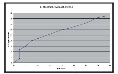
To this end the Lab scale of progressive greys is mathematically distorted to more closely match human vision. If you create an RGB tone scale by dragging a gradient from full black to full white and then posterising it, the relationship between RGB value and Lab lightness value is not linear (see graph). In a profiled system you will find that RGB values below about 15 points will not be differentiated (ie 15 RGB points will appear the same black as 0 RGB points). This will depend upon the linearisation if the system is controlled by a RIP - linearisation is part of the process of profiling a RIPbased printing system.
The bottom end of the tone curve (the shadows) is affected by the choice of media setting on an Epson printer and you should experiment if you are trying different paper types, starting with a guess at the closest match. As we reported in our review of the Epson 7800 some months ago, a choice of Textured Fine Art was poor in comparison to Smooth Fine Art when using Hahnemuhle Bright White Photo Rag (see top graph).
You are currently on page 1
- The Monochrome Issue - The Output Options page 1
- The Monochrome Issue - The Output Options page 2
- The Monochrome Issue - The Output Options page 3
- The Monochrome Issue - The Output Options page 4
- The Monochrome Issue - The Output Options page 5
- The Monochrome Issue - The Output Options page 6
- The Monochrome Issue - The Output Options page 7
1st Published 01/04/2006
last update 09/12/2022 14:59:43
More Monochrome Articles


