articles/Printers/advancedblackandwhite-page1
Printing Using Epson's Advanced Black and White Driver - part 1 of 1 2 3 4 5
by Paul Gallagher Published 01/04/2009

Paul Gallagher- Landscape Photographer
Experience has taught us that if you employ Photoshop's colour management, a good profile, and then print using the Advanced Black and White (ABW) driver, you end up about 11% down on density and about 5-6% lacking in contrast. This has always been a puzzle to us and we have written about it before, without being challenged or enlightened. On the recent Nikon Solutions Expo we had the opportunity to spend time with Epson Technical Specialist, Peter Tinson, to receive his thoughts on the matter. He uses a radically different approach to ours and we decided to investigate.
Armed with McNamee's usual mass of graphs and statistics, here is what we have found after several weeks of testing.
Background
The ABW driver works by dropping the full cyan and full magenta from the mix and then building the grey density from the remaining inks (namely Black, Light Black, Light Light Black, Light Magenta, Light Cyan and (full) Yellow). This has two advantages: there are less strong colourants to drift the tones away from pure colourneutral and a reduction in any long-term fading of strong colourants to cause a loss of density in the print, along with a colour shift away from neutral. Monochrome prints, therefore, are expected to last longer in fade-resistance testing.

ABW in practice
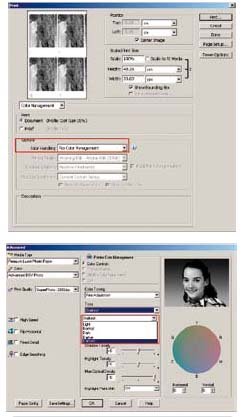
The way currently taught in the Epson Print Academy is to turn the colour management OFF in the 'Print' dialogue box (CS3) or the 'Print with Preview' dialogue box (CS2). This is slightly counter intuitive as, to print in colour, we normally turn the colour management ON at this stage and OFF in the 'Advanced' dialogue box of Photoshop, within the Epson driver. When you change from 'Color' to 'Advanced Black and White' you see the ABW Custom button, then the Advanced button, which will bring up a dialogue box with a host of other options.
We firstly concentrate on the 'Tone' drop-down. This offers the following options: Lighter, Normal, Dark, Darker and Darkest. It is claimed by some that Dark is the equivalent of a linear response but this is challenged by our own data, as we will show.#
You are currently on page 1
- Printing Using Epson's Advanced Black and White Driver page 1
- Printing Using Epson's Advanced Black and White Driver page 2
- Printing Using Epson's Advanced Black and White Driver page 3
- Printing Using Epson's Advanced Black and White Driver page 4
- Printing Using Epson's Advanced Black and White Driver page 5
1st Published 01/04/2009
last update 09/12/2022 14:50:56
More Printers Articles


