


articles/Digital/qualitymatters-page1
by Mike McNamee Published 01/09/2005
Welcome to our extended feature on image quality.
There are only two types of response to an image - to the emotional content, which includes composition,
mood, expression, ingenuity, and to the technical content which includes sharpness, definition, colour accuracy, level of detail, tonal smoothness and print surface properties. In reality, if the latter group is correctly executed, only the former is of interest. In other words once you have got your quality right you can forget it and concentrate on the emotional content.
However, some of these things can also backfire on you. Have you ever been asked why your moody, dreamy intimate shot is so fuzzy? Have you ever been asked "What is up with the colour of your print?"...mine was an iron-toned, silver halide print! You cannot please all the people all of the time, but if your quality is beyond reproach then you have one less thing to worry over. Always remember too that colour should be appropriate, the most accurate rendering of a skin tone may not be the most flattering - the perfect Macbeth chart may not represent the perfect print!
So that sets the scene for this feature. If you want emotional content go look at Dave Newman or Monte Zucker in this issue, otherwise read on.
QUALITY How do we define quality? All of the following parameters must be appropriately satisfied - appropriate means that if you go for a blue mood shot it must be a fairly obvious blue, of your choosing, rather than a goof:
• Sharpness
• Level of detail
• Overall colour balance
• Depth of maximum tone
• Openness of highlights and no burnout
• Evenness of tonal distribution
• A lack of metamerism
• Lack of unwanted noise
• Correct depth of field
• Accuracy of the known colours, especially
o Grass
o Skin
o Sky
o Fruit
o The neutrals
Good quality starts with appropriate lens selection, view point and exposure. It is exposure where we shall begin.
METERING THE EXPOSURE A digital camera behaves most like a transparency (positive) film in that the exposure of the highlights is critical. The perfect digital exposure is one in which the brightest highlight falls around 250RGB points, the mid tone neutrals have equal values of red, green and blue (ie they are colour-neutral) and the lighting control is such that the deepest shadows still contain some printable detail. In practice this usually means that the lowest RGB value in the shadows should not fall below about 15 points. By lighting control we mean that if the range is too high to control the highlight, whilst illuminating the shadows, then you have to introduce more light into the shadows with fill-in flash or a well placed reflector. One advantage of digital is that it is possible to recover shadow detail more easily than highlight detail, noise being the residual problem. Some experts hold that if there is to be any error it should be towards slight overexposure.
However they also say that the exposure should only be slightly over, to the tune of ¼ of a stop. This writer's personal preference remains for a dead-on exposure or very slightly under - it being easier to deal with noise in the shadows than a blown out wedding dress. Other views are however tolerated, especially for shots other than weddings - but remember, the bride (and her white dress) is of paramount importance on the day, the groom's trousers are secondary!
Quality falls off at an alarming rate as you over-expose a digital image. A half stop will be easily detectable and a whole stop may well be unrecoverable if detail is required in the highlights (contrarily, there are progressively less bits available for the shadows, which is where the rapid onset of noise comes in).
CAMERA OR METER? The first decision is whether to trust the camera's builtin meter or to use a hand-held light meter. The main difference between the two methods is that the camera is influenced by the subject, the incident light meter is not. There are up-sides and down-sides to each method. The camera is TTL and accounts for variations in the effective aperture of some zooms and minor differences in light transmission.
It also measures the light off a subject which may be some distance away - it may not be practical to leap forward to take an incident reading alongside the bride; OK perhaps for a formal, but not for a grabbed candid of an intimate moment. In truth, for the candid, the intimacy of the moment may totally overwhelm the technical aspects of exposure in any case, and you have a little more leeway! For such moments you need a safe exposure reading, hopefully erring on the under-exposure side.
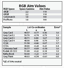
As part of this feature we tested Gossen, Minolta, Sekonic and Balcar meters. They all gave the same reading to within 1/10th of a stop! Other than spot metering off a grey card, no camera, sighting a mixed scene, will consistently deliver this precision. In these tests the exposure meter clearly won the accuracy battle. This is a view and experience, not shared by all. In a recent article in BJP, John Clements found that the meters varied in their compliance with the same camera reading by as much as a stop. We have not found this during these tests; indeed in one series the use of the incident reading, (transferred to a manual camera setting), consistently dropped the mid-tone grey on 127 RGB points, about 1/10th of a stop over-exposed (for Adobe RGB, the mid-tone should be placed at 118RGB). In general use we have found our Nikon D100 places a mid-tone grey about 1/3rd of a stop under the aim value of 118RGB. Remember that the aim point varies according to your RGB working space, a grey card is 49.5% (not 50%) and that 50% on a Lab scale is a reflectance of 18.42% not 18%. It will also pay dividends not to get too strung up on the detail here, your average, out-of-the-box Kodak grey card is quite a variable beast in both colour and density. For the record, the aim values for 50% greys are tabled below, as are some measurements of references that we had to hand.
Note that the spread in the various reference greys amounts to 7 RGB points and that the error on one Kodak Grey Card was almost 4 ΔE - as large as some of the errors we are trying to bring under control! This particular card is visibly different to its cousins in the pack. Note also that the grey Colorama Background paper was as good as the much more expensive reference cards and that the grey paint (thought to be Johnsons mid-grey) also has a very low error.


SWPP - Society of Wedding and Portrait Photographers
The Society of Photographers
Clwyd Chambers, Clwyd Street, Rhyl, Denbighshire, LL18 3LA, UK
Tel 00 44 (0) 1745 356935
Home Page - Find a Photographer - Benefits of Membership - Events and Seminars - Who's who - Photographic Trade Directory - About - Qualification Structure - Mentor Me Programme - Professional Imagemaker Magazine Articles - FREE information pack - Privacy